
Short Sales and Bank-Owned property as a percentage of the total market is a very important topic. One worthy of tracking on a week to week basis. There seems to be a false sense that these are “evenly distributed” throughout the County. Rather than get into a “yes they are; no they’re not” spitting match, let’s look at the actual data.
King County as a whole:
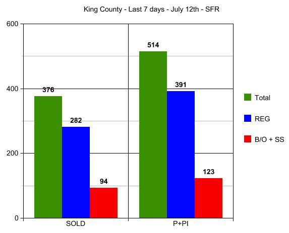
In the graph above we see that 25% of all property sold in King County this week were “distressed” sales. For those who like the break down, 49 of those 94 were Bank-Owned properties and 45 were Short Sales. Not a significant imbalance one to the other. Not a significant difference in % of total sales on those that went Pending this week. I’m counting Pending Inspection and Pending since that will not duplicate the stats and will capture those that went straight to Pending with no inspection requested. That total is almost 24%…so not a big difference between closed sale data and pending sale data.
BUT when you look at some of the break-downs by area…HUGE DIFFERENCES!
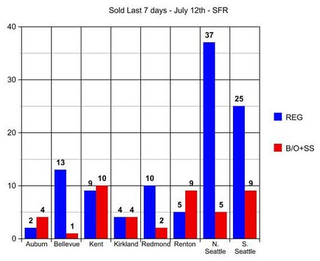
4 out of 6 of the closings in Auburn were distressed property, but only 1 of the 14 in Bellevue was distressed. 9 of the 14 sold in Renton were distressed property, but only 2 of the 12 in Redmond were distressed. Kirkland’s results are over-stated here and usually look more like Bellevue and Redmond’s numbers. You can see that in The Pending Sale Chart which for some reason would not post here, so I put it over on my blog.
I will try to run the stats every Monday so that we can combine them in 4 week comparison blocks. The results will vary somewhat from week to week, BUT some areas are clearly 50% or more distressed property, while others are only 10% to 15% distressed property. Looking at valuation factors for all of King County as a whole will not tell you enough. You could clearly be overpaying for a home in some areas, if you are using a County Wide % as to how much the market is up or down. There is a HUGE variance, as you can see in the graph here and the one over on my blog.
Again, apologies for not putting that 3rd and final graph down here and diverting you elsewhere to see it. When Dustin gets back from having fun, maybe he can figure out why it wouldn’t take.
(required disclosure – the stats in this post and graph were not compiled verified or posted by The Northwest Multiple Listing Service)
Very nice work Ardell! This is very helpful to see. We can talk about this on the radio show if you like. I’m planning on doing some marketing to buy via short sales and after seeing your breakdown of King County, I think I might focus on Renton. I know it’s not the most desirable area, but I’ve always had luck there and I’ve heard Renton is on the rise.
Actually, I like Renton a lot. It’s out of the flight path of the airport, is close to Seattle, Tacoma, and Bellevue, and has opportunity for down town development. It has good access, with plenty of out door areas.
OK, it needs some sophistication, but it is close to Lake Washington, and has it’s own air port.
I see industrialization, small manufacturing, mid rise offices, and ware housing for a diverse job base. After limited amounts of time there it seems to me to be much better positioned than Puyallup, Everett, Bothell, Kent, or even the Rainier Valley that leads to it.
To me it has an undeserved stigma people reserve for Skyway. If they could just pull the city center together it would be a jammin’ little place.
Jack,
That’s only a 7 day tracker…don’t be making long term decisions on a 7 day stat post. Jeez! 🙂 I’m not using hindsight because during the tax credit a lot of people stayed away from short sales. I’ll be doing these calculations every Sunday night. Today I did them on Monday, but there were too many agents postings sales during the day, and the numbers kept moving.
Better to calculate stats while other agents are sleeping.
See you soon!
Any insight into why Bellevue’s numbers are so skewed?
Not sure what you mean by “so skewed” as to Bellevue.
The full weekly data for Bellevue, all of which does not show in either of the graphs that I posted:
Came on market: 32 homes of which none were bank-owned and 3 were short sales.
Went Pending or Pending Inspection 35 or which 3 were bank-owned and 2 were short sales
Closed this week 14 of which 0 were bank owned and 1 was a short sale
Comparing to Sold in the last 30 days:
104 sold of which 9 were bank owned and 6 were short sales – 14.4% distressed.
While the key to Bellevue is often which school vs which zip code, lets start with zip code.
98004-27-4-2 = 22% distressed
98005-20-1-1 = 10% distressed
98006-30-0-1 = 3% distressed
98007-9-0-1 = 11% distressed
98008-18-4-1 = 27% distressed
That could simply be a function of inventory, so let’s check that next
98004-109-3-6 = 8%
98005-54-2-6 = 11%
98006-156-5-17 = 14%
98007-43-0-9 = 20%
98008-118-3-10 = 11%
It will be interesting to see going forward how the relationship of sold reflects (or not) the % of homes available. 98004 had the highest sell off of distressed property in the last 30 days, so that is likely why that zip code now has the lowest % of available distressed properties. Somewhat the case in 98008 as well.
I don’t see Bellevue’s results as any more “skewed” than Redmond’s. I would expect Auburn, Kent and Renton to be “skewed” to the higher side with more distressed property and Bellevue, Kirkland, Redmond and most of Seattle to be “skewed” to the lower % of distressed property. The results match my perception prior to having done the data.
If the whole County is 25% distressed property than some are 50% and some are 10%, and the results match what most people would expect, I think. Why do you single out Bellevue as “skewed”? Can you elaborate on that?
(required disclosure: Stats in this comment are not compiled, verified or posted by The Northwest Multiple Listing Service”)
These are some awesome stats, have you posted any subsequent reports recently? Would be great to see if there are changes over time, or even a larger time sampling like YTD or during the tax-credit period. Thanks for posting!
Gustavo,
I purposely am not doing YTD because many buyers avoided short sales and even bank owned property during the tax credit period. They were too afraid to lose the $8,000 credit. So the statistics from March and April would automatically be fewer of those types of sales, and would not be a good indicator of how many there really are in the area.
Going forward I will clearly be doing more stats like this, but decided “every 7 days” would be too redundant and somewhat boring. I will be sure to write another during the first week of August. I will be on vacation that week, but should be able to pull the stats and do a post around August 7th or so. I like to give 7 days for agents to register their month end sales before posting month end data.
Gustavo,
I just realized you have the same access to compiling this info as I do since you are a local agent. Would you like me to show you how to do that?
That would be awesome. I tried getting similar data on Matrix but querie results seem to get truncated and don’t give precise data. I’ll shoot you a mail to discuss. Thx!
Gustavo,
The Matrix system has been improving. In the upper right hand corner now there is a # of properties, and yes it went only to 500. Then it went only to 1,000, then it went only to 2,500. Right now it goes up to 5,000 and that may increase too.
But we had some limitations in the old system as well. The way I find around it in either the new system or the old system is to use price as a break point, and then add. For example:
How many single family homes are for sale in King County? Step one says 5,000+ so you need to get to a number less than 5,000. I put in 30 (to exclude rentals) to $375,000 (30-375) and I get 4,722 homes.
4,722 homes priced under $375,000 for sale in King County of which 419 are bank owned and 1,186 are short sales.
Now I move to 376-2000 ($376,000 to $2M) and I get 4,938 homes. You just keep moving the second number until it is under but close to 5,000. 140 of those are bank owned and 430 are short sales.
Now to capture the rest you do 2001+ ($2,001,000 plus) and you get 360 of which 4 are bank owned and 3 are short sales.
4,722 + 4,938 + 360 = 10,020 homes for sale
419 + 140 + 4 = 563 are bank owned with a majority of those priced at $375,000 or less.
1,186 + 430 + 3 = 1,619 are short sales with the majority priced at $375,000 or less.
5.6% of all homes for sale are bank owned properties (563 divided by 10,020)
16.1% of all homes for sale are short sales (1,619 divided by 10,020)
8.8% of all property for sale under $375,000 are bank owned properties
25% of all property for sale under $375,000 are short sales
So 1/3 of all property for sale priced at $375,000 or less is a bank owned or short sale property.
You can move the numbers around to capture smaller segments, like $400,000 to $600,000, and calculate at what point the market moves from 50% distressed property to 10% distressed property. Some of that is price…some of that is area as I’ve shown in this post.
In the areas I work, there are 8% to 15% distressed properties for sale on any given day. Each agent should calculate that for the areas where they work.
Feel free to call me, but I prefer to explain on the blog so other agents can see it, rather than have them all call me 🙂
Clear and concise, nicely done! Great to know this can be done by querying the MLS like a regular user. Thanks for the input, I look forward to your future number crunching posts 🙂
The important thing about the new mls system is that it is continually evolving. Every time I do stats it seems to have been improved. It will take some time, but eventually it should work almost as good as the old system in most ways and better in others.
I want to do stats on “best schools” as that seems to me more of a pricing factor than area. In Bellevue for instance, pricing has more to do with which Elementary School than “school district” and the new system lets us put in all top ranked schools at the same time. Unfortunately it is a lot harder to get to “median price”. You have to use the CMA feature for that, and then there are limitations to 100 homes, last I looked. You can’t add “medians” the way you add # of properties…so it gets a lot harder to calculate median home price.
Yes, there’s a ton of stuff I like about Matrix, including overall usability. I’m particularly interested in stats about distressed sales, “shadow” REO inventory (which there is a great post on here, nice!) and the like. Want to see if some of the assumptions we’re making can be backed up by data, especially things like impending waves of REO’s coming up, short sales rising/decreasing by area, price, etc. Your posts have been super helpful. I’m interested to see how much can be done manually and whether any automation can be built in to generate these reports. We’ll see.
Too much automation is not good, Gustavo. Once you do the stats yourself…you will never believe what you read again! LOL
The numbers change so dramatically from one area to the next, that it is important to know the “small picture” more than the big one. That there are 50% distressed properties in Kent doesn’t help me when I’m only working in areas with 10% short sales.
What areas do you work most? For me it is Kirkland (through Bothell), Bellevue, Redmond (through Issaquah) and surrounds and Green Lake and surrounds. A majority of my clients work at Microsoft. So King County as a whole stats do me little good in my day to day work. But I still study and post them for general market trend purposes.
When I’m looking for the impact of “Spring Bump” or the Tax Credit…I have to look at the County as a whole. When I’m looking for the impact of short sales and bank owneds on the property values of other homes…I have to pull the data closer. Not too close like “neighborhood”…but closer than County Wide.
There’s a lot of “common sense” to be applied vs simply “doing the stats”.