Style Trends in Kitchen Cabinetry, Exterior Paint Colors, Interior Paint Colors and other choices for your home, based on recent sold homes in The Seattle Area.
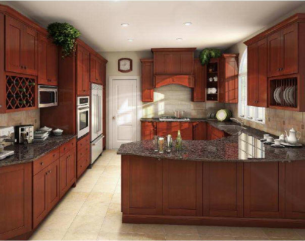
Kitchen Cabinets Shaker Style with recessed flat center panel and hidden hinges.

Definitely one of the most popular styles in various colors and NO hinges showing.
What’s not Hot? Hinges showing and/or a heavy OAK grain pattern in the wood.
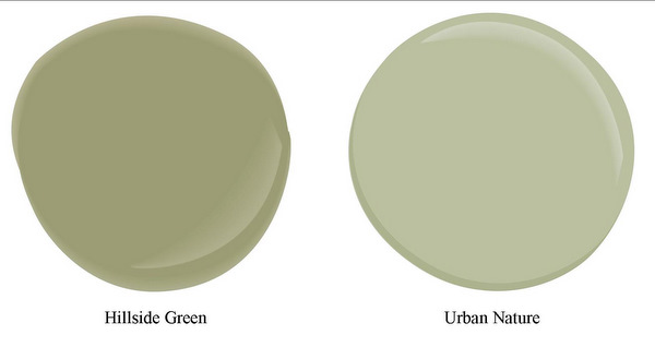
Paint Colors While true neturals like Manchester Tan continue to be the best if the home has one overall color, I am seeing quite a few green and green/gray tones in homes sold recently. White ceilings with the Hillside Green paint seems to be the most popular right now.
Two good choices from Sherman Williams Pottery Barn Spring colors are Hillside Green and Urban Nature.

What’s NOT hot in paint colors? The deep red and blue colors that were popular a few years back, with every room a different brash color.
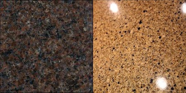
Counter Tops Still no real consensus on what color of granite..but granite is still the best choice vs tile countertops. Though for some unknown reason people don’t seem to care much if it is slab granite or granite tile squares, if it is a quality job. Having a granite bullnose edge vs a wood frame edge seems to be the deciding factor. 
One of the reasons I’m reviewing Style Choices today is I am meeting a client at the Show Room tomorrow to select granite and tile. Will be interesting to see what she chooses. The lighter color on the right is usually the safer choice. but it depends on the cabinet color.
Tile Size, Color and Shapes Often tile is the hardest choice as there are so many different options and uses for floors, back splashes and tub surround accents. While granite is definitely the counter top of choice and hardwood is the definite preference for flooring in the kitchen and the entire main floor, tile is still used abundantly. Except for the main floor 1/2 bath “powder room”, hardwood is rarely used in other bathrooms. Tile still the #1 choice for bathrooms and laundry rooms. Tile is also the #1 choice for showers (vs one piece fiberglass units) and for tub surrounds.
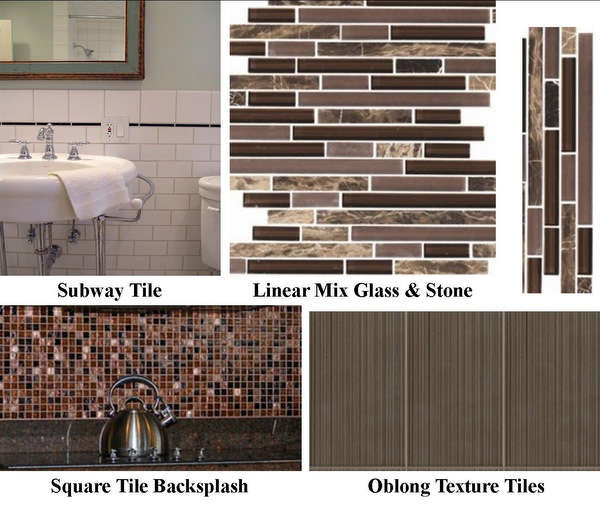
I’m still seeing some subway tile, but it’s a very limited choice that I don’t think is going to withstand the test of time well. That could be from my many years standing in real subways, which are generally not the most happy and attractive places to be.
Glass tile still popular, but only when mixed in with stone tile. Oblong textured tile is awesome, but also limited use given it’s contemporary feel. Solid, neutral 12″ stone tile still a favorite for tub surrounds and flooring. Below are some of the most popular current choices as seen in both new homes and remodeled older homes sold recently.

What’s NOT hot in tile in The Seattle Area? Travertine, Terra Cotta and other ornate styles that work elsewhere, but not here.

Ardell- Your experience pretty well agrees with mine. When I update a MCM
Mid-Century Modern– including our own shown below- I usually repaint the
existing dark brown exterior with something lighter- a warm “mustardly” color
in our case. However “Trendiness” per se is something I usually eschew. Good Post!
http://o5.aolcdn.com/dims-shared/dims3/PATCH/resize/600×450/http://hss-prod.hss.aol.com/hss/storage/patch/b1fb6695be5de067d22134a7b1f57da8
Thanks Jerry. Exteriors are tending toward darker colors right now for larger two story homes and “brightened” natural colors in Cedar Shingle patterns in the peaks as accents. Lighter colors for one story homes always work best, I agree.
Deep blue is still working well for front doors and some Cratsman Style homes with creamy white trim.
Jerry,
I think the oblong texture tiles look great in mid century moderns. Looks great on the tall fireplace surrounds replacing heavy stone or brick looks of the past. The one I show here is a bit dark, but the lighter ones don’t show the pattern as well in photos. Look great in person though!
Ardell, I have the exact same small tile glass backsplash in almost the same brown color, the same floor tile including color and granite counter top, my cabinets do not have hinges showing, its looking like the style is the same in Pa too
Well, there you have it. Hinges are OUT…Coast to Coast. LOL!
Pin Hinges were invented a long time ago
by Washington Line in Tacoma. They’ve been the
Way to Go.
I don’t think they are using “pin” hinges, Jerry. I think they are “European” hinges. If they are at the showroom today, I’ll let you know. But I don’t think so. They may have some doors around for choosing hardwood and tile colors, but usually not full cabinets with hinges.
The property in escrow is a zero lot line (or close to zero) new home for under $300,000. So the options may be minimal. It’s more like a freestanding 3 bedroom townhome. I took pictures over at the model yesterday to see what we need to be selecting. Kitchen has wood floor and no tile. The granite counters become the backsplash and also the fireplace surround. So one granite choice covers all that. Carpet color, paint color (exterior only – no choice on interior). tile choices for bathrooms include an insert of small tiles in all bathrooms with the countertops tile vs granite.
Exterior facade choices for this one and the last one I did with a client include the limited use of beadboard. On the last project we eliminated the beadboard. The verticle lines, very commonly used in mid-century moderns, aren’t as popular these days except very sparingly.
Speaking of house colors Ardell, I wonder what you think
about what’s apparently a new exterior paint color trend.
http://knol.google.com/k/jerry-gropp-architect-aia/jg-on-brightly-painted-mcms/246qxuxd260sm/197#
I wouldn’t call that “a trend”. There was a very brief period for the yellow/orange/salmon/burnt sienna colors in interiors. Didn’t last long or work in most houses. Not common as an exterior color, though I have seen it here and there.
Not bad. I think people should feel free to be creative if it makes them happy. Problem with that one is the roof matches the car and the house matches neither. If it were a brown toned roof it would likely work a lot better than with a dark gray roof, don’t you think?
Also, I will be selling their 1963 built home after they move in to the new one. We are likely going to replace the current cabinet doors with hinges showing with these “shaker” doors. The home will be priced around $250,000 or less, so we may only replace the doors and not the full cabinets. Still pricing out the improvements. Pulling the carpet and refinishing the hardwoods instead of installing new carpet on the main floor. We’ve already determined the general staging colors in Tuscan, it being my favorite choice for older homes built prior to 1990.
A- Here’s a good article on Kitchen Cabinet Hinges. I’m always
impressed with how thorough you are in your RCGuide Posts. J-
http://www.home-style-choices.com/kitchen-cabinet-hinges.html
Thanks Jerry, I enjoyed that. Exposed hinges became an issue when we started changing out the knobs from brass to brushed nickel. Then those who changed both the knobs and hinges got “stuck” again when the trend turned to oil rubbed bronze in dark brown.
A lot of confusion right now with builders mixing these somewhat randomly. Formal areas and the Master Bath are more often using the oil rubbed bronze, even the hinges and knobs on an oversized white door. The darker color receiving the higher positioning in the master bath vs the hall bath in the same homes. Shower enclosures using the darker color still look a bit odd at times, especially when the builder is putting silver faucets in the sinks in the same room. Many with the darker knobs on the cabinets but silver faucets…looks a bit schizophrenic.
Serious “crafstman” homes are using the oil rubbed bronze pretty much everywhere including the light fixtures and door hinges.
I’ve seen some darker wood window casings and baseboards coming back. Some are using white in the formal areas and dark in the informal areas. Looks a bit odd when they “meet” at the entrance to the kitchen from the dining room.
One of the main points of contention is when a pantry exists between the kitchen cabinets. Do you make the door white or try to match the cabinets? Usually they are white, as the door make is not the same as the cabinet maker, so a true “match” is often difficult.
Some other oddities are dark floors with white baseboards with a 1/4″ round where they meet. Some use the white quarter round, others try to match the floor color with varied success.
The larger the house, the harder it is to keep one theme going throughout in hardware and style. But in my experience, that has often been the case for homes over 2,500 sf.
Ardell- I didn’t mean to overload you or your readers with Hinge Information but as you point out, details are important. Here’s one of the Gropp family homes I’ve built and passed on to other families. They all had one theme throughout which as you point out in the Post is very important.
https://sites.google.com/site/jgropp2/_/rsrc/1304987095399/alterationsanadditions/KRB.bmp?height=257&width=400
Ardell- Here’s more on the preceding Gropp Family Home. Only too often do these get changed by the next owners in ways not always in keeping with the original concept. And that’s why I like to remain involved.
http://knol.google.com/k/jerry-gropp-architect-aia/as-it-was-then-and-how-it-is-now-many/246qxuxd260sm/162#
I loved the hinge link. Never too much info on details.
The fireplace in that link is exactly the one I was thinking of (that I’ve seen in many homes) that I think would look great in the Oblong Texture Tiles to update from the brick. I would think you can tile right over the brick? Do you know?
As to “The fireplace in that link is exactly the one I was thinking of (that I’ve seen in many homes) that I think would look great in the Oblong Texture Tiles to update from the brick. I would think you can tile right over the brick? Do you know?” covering up the brick is what I think makes no sense.
Yes, you can paste tile on the brick- but you shouldn’t.
Is the brick just a facade? Will the fireplace still function properly if you “pop” the brick and tile it?
As to: “Is the brick just a facade? Will the fireplace still function properly if you “pop
That’s what I thought, Jerry. That’s why I suggested one would tile over it. I don’t see another way to update the brick “look”. Do you? Some have painted it white…and that worked 7 to 10 years ago. But now it just looks like painted brick. 🙂
Ardell- As to updating- some things are better than what’s being done now.
Brick is an example- if it was good to start with, it’s probably still good.
On the other hand, we stuccoed over the “wrong”brick in our present home.
Here’s a picture- stuccoed over “wrong
Not sure why you are against using stone or tile for updating. But the right stone or ceramic or granite tile is generally be best way to go from what I have seen. Painting or Stucco over it end up as a minor camouflage measure vs an upgrade. Works for some properties with limited upside value potential…but not for most homes.
These modest change outs are what people would likely value more.
http://www.homebedazzle.com/fireplace.htm
Another HUGE issue about fireplaces is most people want gas fireplaces now…not wood burning ones at all. They want to flip a switch to “turn on” the fireplace, not “burn” things in it.
Here’s a short and sweet How To for tiling over the brick.
http://www.thisoldhouse.com/toh/asktoh/question/0,,20065453,00.html
A few more before and after shots showing how much lighter and brighter the whole room is after negating the brick fireplace.
http://hookedonhouses.net/2008/02/11/before-after-giving-old-fireplaces-a-new-look/
Ardell- These are all good examples of making dirty and/or bad or indifferent fireplaces better.
It’s entirely different if you start with a well-designed, well-maintained firplace (with a gas log)
and make it mundane.
My Link below illustrates what I’m saying about our Kid-Raising Barn.
http://knol.google.com/k/jerry-gropp-architect-aia/as-it-was-then-and-how-it-is-now-many/246qxuxd260sm/162#