Real Estate – Why DATA is the New Black

Early Friday evening one of my favorite long term clients asked me this question: “Why is the market so slow these days? I have an alert for ($) houses in (zip code) and I barely get a couple of hits every week west of (the freeway). Almost always tear-downs.” (actual specifics from his email removed)

My first data set pulled was a line up the number of homes sold where I primarily work (North King County – North of I-90), by month, over the last 6 years from 2009 to 2014 YTD. This to answer only the first 8 words of his question “Why is the market so slow these days?” The easy answer would be “because it is past October 15th”. I test my knee jerk response by pulling all of the relevant data to be sure I am not answering like grandma in a rocking chair pulling some now irrelevant data from her long term memory bank. I also do this because I need to discover why this person’s current perspective may vary from the long term norm.

Something may recently have happened leading this person to believe that the standard progression is no longer the realistic expectation. I value his thought process as part of how I answer the question…by first pulling the data…lots and lots of data.

The line graph below documents the data pulled for the last 6 years. But as I almost always do when pulling stats, I went back 12 years because data expires! More on that in graphs 4 and 5. Since I almost never regurgitate already documented data from other sources, but rather only trust the data if I calculate it myself, I usually go back as far as my data source will allow, which in this case was 12 years.

First I test my perception that 2014 is not a low inventory year, even though there are tons of articles saying that inventory is low. Many articles talking about the frustration of buyers with “low inventory”. But look…no…my perception is indeed correct. The red line is the “low” or at least the first half of 2009 depicted in the red line. The green line of this year is not only NOT “low”…it is pretty close to the high over the last 6 years.

To be clear, I am using “homes worth buying” as “inventory” and the proof that they ARE homes worth buying…is someone actually bought them.

Volume 2009-2014

After I peruse some of the recent data as an attempt to start at the point where he may be coming from when asking the question, I dive into my own “expert opinion” perspective, which is my 2001 baseline. This information is really already carved in my brain, but since I turned 60 this year I figure it wouldn’t hurt to double check that my memory is still accurate. 🙂

Volume 2001 baseline

I actually did all 12 years before honing in on the actual answer to the question, which comes from comparing 2014 with 2013 and 2013 with both 2001 and 2005.

To determine which were the correct comparison years, I had to first pull ALL of the data that the data source would allow.

While yes…my knee jerk answer of “because it is October” would have been correct, by pulling all of the data I can see from the variance of the actual stats from 2013 against the baseline of 2001 exactly why the question made 100% sense from this person’s perspective at the time he asked it.

This person, along with every average homebuyer, is looking week to week over a period of 6 months to 18 months for a home to buy. They have no “baseline perspective”. Their expectations come from more recent history’s actual activity, and rightly so, with no way to tell if the last 6 months was exceeding or under performing standard market expectations.

The bar graph below explains where the expectation may come from. I have 2005 in there just because it is the one year over the last 12 years when the most number of homes were purchased (ipso facto “available” to be purchased), so highest inventory year. But the key to answering the question is in the 12% of June 2013.

If you look at every piece of data on this page which looks at all 12 months for all 12 years in 6 different comparative charts…12% of a full year’s total inventory being available to buy in one 30 day period is pretty much unheard of! That was June of 2013.

I had another client who started looking in early 2013 and did not buy the house they could-should have purchased in June of 2013. After that they were progressively and continuously disappointed with the number of homes that came on market for months and months afterward. They had no way to know that the volume of homes coming on market since they started looking were many more than the normal market expectation.

In hindsight every subsequent month looked pss-poor in comparison. Pretty much all activity if you started looking in April of 2013, and didn’t purchase by June-July of 2013, is looking relatively dim. BUT in reality inventory is not dim. Inventory, the number of homes you can expect to choose from, is in fact currently performing at or over market expectations adjusted weekly for seasonality. All this can be gleaned from the 12% spike in that bar graph, noting the rational explanation as to why your expectations may be “off” by comparing relatively recent actual data against 12 years of data comparisons.

Basically that makes us both right. I’m right at “because it’s October” and the person asking the question is right to consider the options dim based on more recent relative comparison.

Volume 2001-2013-2005

Posting the data and graphs that helped formulate the above. Worth noting, while I brought forward the Red Line year of 2009 to note inventory low point, the graph below shows that the 12 months of low inventory started in the 2nd half of the gold line of 2008 and proceeded to the lowest point of Jan and Feb of 2009, which some of my readers may remember as “my bottom call” that made front page news at the time.

Volume 2005-2008

Looking above and below at the thick green line of 2014 inventory against the high inventory years of both 2004 and 2005 you can easily see why all of the articles calling 2014 low…and actually they were saying that last year in 2013 as well, are simply not true.

Volume 2001-2004

While my analysis will continue to use 2001 as a baseline, you may want to use the bar graph below to set your expectations. This is the average good homes on market based on the average of 12 years worth of data.

I use 2001, as many of the variances over the last 12 years are influenced by Tax Credit Incentives coming in and out and artificial interest rate jockyings…not to mention all of the massive changes in loan approval criteria over this same period. For that reason 2001 is still the purist baseline by which to compare and contrast other market influences as they come and go from time to time.

WHY IS THE MARKET SO SLOW THESE DAYS?

Getting back to the first 8 words of the original question…because based on normal seasonal activity you can expect that there will be HALF the number of homes coming on market that are worth buying by December than in May. “coming on market” activity is the month prior to the sold month. So highest SOLD volume in June will = highest number of instant alerts of new listings coming to your phone in May.

Expect the numbers to increase from December through May and then begin a decrease through year end before beginning the next climb.

Volume 12 year average

WHY IS DATA THE NEW BLACK?

Because it saves you time and reduces your stress to DRILL down the data from the general comparisons above and fine tune your actual parameters before you waste any time looking for something that doesn’t exist in the place where you are looking. That brings us to the 2nd and 3rd part of this person’s question ” I have an alert for ($) houses in (zip code) and I barely get a couple of hits every week west of (the freeway). Almost always tear-downs.” (actual specifics from his email removed)”

Only 25 houses were sold using a full $150,000 spread with your $ amount as the cap in the whole 6 months of “high season”. So expecting 2 a MONTH in low season let alone 2 a week…is an invalid expectation. Expect ONE really good one a month from here to February of 2015.

“Almost always tear-downs” means you are looking for a nice home at the price of the land alone. Again an invalid expectation. Changing your price to what that home will sell for there is not an option. Changing your choice of what to a tear down is also not a reasonable option.

The only answer to your dilemma is to change the where and not the price or the what.

(Required Disclosure: Stats in this post are not compiled, verified or published by The Northwest Multiple Listing Service.)

Costco Signs Major Lease With Vulcan – Issaquah

costco vulcanJust received a press release that Costco is leasing 176,656 sf of space from Vulcan (Paul Allen) Real Estate at Sammamish Park Place in Issaquah. Sammamish Park Place is a 3 building complex totalling 586,823 sf with the other two buildings being occupied by Microsoft.

This complex was built in or around 2000, so I am wondering who left that Costco is replacing. I don’t see any stories on this move yet, but will post a link if and when someone else picks it up with more info.

Selling a Kirkland Condo – Staging and Photos

condo windows

Whether I am helping a client sell a house or a condo, my thought process is generally the same.

Start at “buyer profiling”. Who is likely to buy this property? Then make a list of the top 3 to 5 reasons why THAT person, whom you have targeted as the likely buyer, will choose THIS property over others that are for sale.

The first part, “buyer profiling” is an old method I learned when I was a Certified Corporate Property Specialist for Coldwell Banker back in the 90s selling vacant properties where the owner was relocated for job reasons. There is less of an emotional pull from the owner, and the process is more of a business effort to sell, with little to no accommodations for the seller’s emotional “triggers”.

For this condo, which was sold about a month ago, I determined the individual would likely be a single professional person…or at least that would be the person who might pay the highest price for it. I also determined that the person (or possibly couple) would likely be younger vs older because there were a lot of steps up to the front door. Not likely an “empty nester”, as might be the case for a ground floor unit with no steps.

Next I listed the reasons why someone would choose THIS condo over the other 65 or so condos for sale in Kirkland at the time priced at $250,000 or less.

1) View of Lake Washington (only 6 of 65 have a view of Lake Washington)
2) 1,000+ square feet (only 11 of 65 are over 1,000 sf)
3) Super high ceilings on the inside interior walls of the main living space
4) Clerestory Windows at the top of the high ceilings
5) Travertine and “wood” floors vs carpet

It is very important that you match your staging and photos to the main selling features of the property. NICE is not good enough. This particular condo is a great example of that because the owner hired a professional stager and I had the photographer take photos…but…

I just wasn’t happy. I didn’t feel the property would sell at its highest possible price based on that in person and online presentation. It was nice, the photos were “good” and better than most if not ALL other properties for sale. But they just didn’t tell the STORY of THIS condo well.

condo before after 1

condo before after table

condo view from sink

Kirkland Condofull set of before photos and the full set of after photos click on those links from the photographers site at HD Estates.

I use Brooke at HD Estates for my listing photos, and it was funny that when she first came she knew immediately that I had not staged the condo. She had done several of my properties this year, all of which I had staged myself, and she just knew. The tired old floor lamp with the fern…the granny orange shaw vs the red throw…the weeds on the table vs the art deco glass bowl…even in the bedrooms and bathrooms she just knew something wasn’t quite right. 🙂

I’m glad I went to the extra time, trouble and cost. The owner paid $92,700 for this condo just two years ago and we were able to sell it in less than a week with five offers at $233,000 with no home inspection contingency and no must appraise clause.

Might that same result have happened if I did not re-stage it myself and have the photos redone? I don’t really know for sure. What do you think?

Seattle listed as 2nd hottest housing market for 2014

The new Zillow predictions for the 2014 housing market show Seattle as the second hottest market in 2014.

They also predict only 3% increase in prices overall, so “hottest” could be kind of cool. 🙂

Personally I think it all depends on how many sellers come out to play this year. You will have your same average turnover for must sell reasons. Relocations as example. But with most sources predicting a slower increase in home prices and possibly a slight turn down, perhaps those sellers waiting for a better housing market will succumb to the fear that it might not get any better than this.

No one knows how “hot” the market will be, but the more sellers there are the “better” it will be whether there is growth or not. Zillow is also predicting rates will get to 5% by year end, but that looks more like someone trying to create a sense of urgency whereZC there really isn’t one.

Selling a Home in King County 2014

Selling a home in King County has been fairly easy to do for most people since early 2012 when the market started taking off again. We don’t have the same momentum in first quarter 2014 as we did in first quarter 2013. There are still many more home buyers than home sellers, so supply and demand hasn’t changed much. What has changed is there is not the same sense of urgency to beat out interest rate increases.

In early 2013 interest rates were as low as 3.25% in many cases and there was a lot of talk about them going up to over 4%. They in fact did go up to 4.5% – 4.625% by mid 2013 and no one is talking seriously about them going up further from here to over 5%. So same supply and demand factors…decreased sense of urgency. (chuckling as I just got an email while typing this that rates went down from 4.5% to 4.375% confirming no worries that rates will increase much if at all from 4.5% or at least that worry is not being factored into the market.)

There has been a LOT of confusing talk about “low inventory” for quite some time now and even some recent talk that inventory is improving for home buyers. Not really the case IMO and as you can see from the arguing going on in the comments on that post. Most people are not buying that there are or will be a better selection anytime soon for most home buyers. That is continued good news for sellers and more frustration for home buyers. New on market if priced right…IF PRICED RIGHT the key phrase here, will still sell quickly in multiple offers. So not a lot of change in 2014…just a little less chaos.

Now let’s talk about how inventory can be UP a bit on an overall basis and still be non-existent for MOST home buyers. The graph below illustrates this fairly well. Until you get to a million dollars, EVERY segment is running at less than 2 months of inventory. I would venture to say that probably 80% of those are homes no one wants…or someone would have bought them, except for the 20% or so that are very new on market and some of those are coming out the gate overpriced as well. Most sellers can still sell their homes in a week or less if they really put the right effort into selling their home, and keep the price at no more than 5% over the comps. So it goes without saying that for most buyers…there is nothing to buy.

As soon as something good that is priced right comes on market…still multiple offers after the interest rate increase to 4.5%. I haven’t witnessed it first hand so far in 2014 given it is early in the year, but that was the case throughout the 4th quarter of 2013, so no reason to expect that to change now. With less than 2 mos of inventory starting out the year, not likely we will get to any type of equilibrium as to sellers and buyers at all in 2014 except in the highest of prices. Even then…not so much in places like Clyde Hill where highest of prices still sells very well. More on that in the third price graph.

kc.absorption.2014

To better understand the absorption rate bar chart and why the price breakpoints appear to be “odd”, see the pie charts below. First using 2013 sold homes I broke the market into 5 pieces. So the first column above represents 20% of King County buyers. Each of the second, third and fourth columns also represent 20% of home buyers.

That puts 80% of buyers in the 1.25 to 1.63 months of inventory range. 80% of people looking to buy a home are looking at less than a two month supply of inventory and in many cases a 2 week to 5 week supply of inventory. Subtract the houses that no one wants…and you basically have NO inventory for 80% of the people looking for homes.

ALL of the last FIVE columns represent a breakdown of only the top 20% of the market. This in an effort to see where the inventory actually starts moving up.

It is not until you get to TWO MILLION and up that you actually see a buyer’s market. Everything up to $2 Million is a Seller’s Market at less than 4 months of inventory and for more than 80% of buyers less than a 2 months supply of inventory. Now let’s drop down to the last graph and check on home prices.

kc.2013.2014

One of the reasons I check the stats at the beginning of each year is to test both my perception and also things I have been hearing and reading.

My perception was that Bellevue 98004 and 98005 were taking off like a rocket last year! To check that I added stats for just those two zip codes to my King County median price line graph. It is the purple line at the top with the light blue squares, and yes, my perception was correct. Up way out of proportion to the rest of the market. But the earlier part of the graph also showed a steeper decline which looked like “the bigger they are the harder they fall”. Still…almost back to peak pricing in 98004 and 98005.

The County as a whole also way up toward all time highs. Not quite there, but looking pretty “recovered” for now. As usual I am not really just “writing a blog post”, I am doing my own early work for my business. So in that regard I have to see how Kirkland, Bellevue and Redmond are generally faring compared to the County as a whole.

I need to study what is going on with Kirkland stats. For the Eastside line (green with pink squares) I combined 98033, 98034, 98011, 98052, 98004 and 98005. Not all of “The Eastside”, but a good balance of representation. It might make more sense to throw in more of the Bellevue Zip Codes instead of one of the three Bothell Zip Codes, but you can’t do that if you are going to track prices back to 2007. Kirkland, the blue line with the light blue squares, starts running under the main Eastside line. This because most of the large land mass annexed by Kirkland in 2011 was lower priced than the Kirkland before annexation. You see that dip between first quarter 2011 and first quarter 2012 when the median price went all the way down to $401k.

Considering that dip…for Kirkland to be back up to $510,000 is really quite amazing. I thought maybe the higher priced 98033 was carrying all of the increase similar to the big swing in 98004 and 98005. But not so. I tried to add that line here, but it just made the whole chart too confusing with all of the numbers overlapping. But the amazing part of the increase in Kirkland (which looks like a decrease because of the added properties) is that much of the increase happened in the annexed areas, especially in that part of Kirkland 98034 that used to be Bothell 98011. Back to why I added Bothell 98011 instead of more Bellevue Zip Codes. The later stats for Kirkland would automatically pull in some of what used to be Bothell 98011 prior to 2011, so the best answer was to keep all of 98011 in all the way through.

A little more explanation and graphs including Absorption Rate Data for Kirkland 98033, 98034, Redmond 98052 and Bellevue 98004 and 98005 in these links. Again just stuff I was working on for my own client reasons.

median price

Home Prices Are Coming Down

home prices correcting

Home prices are beginning to trail down toward year end with an abrupt 5% decline in the last 30 days.

While we are still at 12% increase for the year following the downturn, this is more than merely seasonal change, in my opinion. Every year has a “Spring Bump” that usually does not sustain at peak levels past June-July. A downturn in August is always expected and the market continuing flat to down to year end is also expected.

What’s different this time?

1) We are coming off a bubble created by home buyers vs home sellers. In 2012 it was a Seller’s Market where home prices were primarily driven by sellers asking more for their homes and the buyers complying with the sellers’ desire. 2013 increases were largely driven by buyers aggressively competing for the same homes. The buyers giveth and the buyers taketh away will be the message of 2013 from here to year end.

2) Mortgage interest rates increased by a full 1% immediately prior to this “seasonal” downtown. How much of this decrease is seasonal and how much is interest rate driven? Difficult to separate that out, but if you go back to reason 1 above we can see the market deflating the bubble created by those buyers who were racing to beat the interest rate increase. The race is over. Yes there are some buyers who are still trying to beat the next interest rate increase, but nowhere near the aggressive level of buying while mortgage rates were still under 4%.

3) The stock markets are dipping at the same time. This is not a small factor. Seattle Area Home Prices often if not always emulate the stock markets. When the stock market is going up and there is a slight downturn in home prices created primarily by seasonal factors..well than you can see it’s simply a seasonal correction. But when we are at the same time seeing stories like Dow Jones – Is the Bull Market Over? and S & P Corrective Phase Could Last Until Early October, we know that the Spring Bump correction phase will likely last until every drop of seasonal push is drained, which is usually October 15th.

We can expect a one week or two week robust period in September, because we always have one for usually no good reason. But the season is over…and then some. 2012 was a good year. 2013 was a year that was too good for sellers and not fun for buyers. 2014 should look more like 2012 than 2013.

Don’t expect anything but down from here to year end.

Home Buyer Education Seminars

I am teaching two Home Buyer Education Classes this month sponsored by the Washington State Housing Finance Commission.  Anyone who is interested in buying a home can attend – our class is not limited to first time home buyers.

Home buyers who are interested in programs offered through the Washington State Housing Finance Commission, such as the Home Advantage Program with down payment assistance, are required to take a WSHFC sponsored class.

If you’re interested in attending a class where I will be teaching, you have two opportunities this month:

  • Saturday, July 13, 2013 from 11:00 am to 4:00 pm in West Seattle at the High Point Library. My co-instructor is Ira Sarachoff.
  • Saturday, July 20, 2013 from 11:00 am to 4:00 pm at the Greenlake Library in Seattle. My co-instructor is Jim Reppond.

Lunch is being provided at both of these classes… however, if you have dietary restrictions (or you’re a picky eater 🙂  you may want to bring your own sack lunch.

Both classes are FREE. If you’d like to attend, you can rsvp here.

I’ve always felt that an important part of a mortgage originators job is to educate their clients and make sure their questions are answered before they get to the signing table. I’m very excited to be a part of the Washington State Housing Finance Commission’s program.

How and Why CASH Infusion Fuels a Housing Recovery

housing recovery Removing the Must Appraise Clause.

BEFORE you as a buyer of a home agree to “remove the must appraise clause” you need to know that means more cash from you the buyer of an undetermined amount. You also need to know the Finance Contingency does not usually cover not having enough Cash to Close.

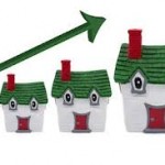
Cash bridges the gap between Appraised Value and Sold Price in a Housing Recovery. 2012 not so much. Early 2013 we are seeing “remove must appraise clause” as a condition of acceptance in multiple offers more so than last year. I did see a few last year. Mostly flip houses with a huge change in price from “bought at foreclosure” to 3 months later “sold as flipped house” at almost twice the price as the flipper just paid for it.

This year removing the “must appraise clause” in most all upwardly mobile neighborhoods has become a given.

Sellers are not necessarily choosing highest offer in multiple offers, unless that highest offer also is all cash with no must appraise clause OR the buyer is willing to fund the appreciation with cash.

Because this is so very common right now, and will continue to be so through at least this season into August, people need to know what that means.

LENDERS are not supposed to Fund a Housing Recovery.
THAT is WHY we had a Real Estate “Bubble”.

Lenders bridging the gap between Appraised Value based on “comps” and what a buyer is willing to pay for a house, is a lot of stale air…a bubble. Appreciation fueled by cash from the home buyer is a more stable and historically common form of funding home price appreciation.

Agents get mad when a house doesn’t appraise. That’s just crazy thinking. Let’s take a look at an example as to why that is. Let’s assume the homes are equal in all ways in the example below.

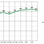
Asking Price – $500,000.00

Last home sold in neighborhood – $485,000
House before that sold – $470,000
House before that sold – $460,000

$500,000 Asking Price house goes into multiple offers and sells at $515,000.

Buyer is putting 20% down. 20% down of WHAT? Buyer thinks he is putting down 20% down of the Purchase Price. BUT the lender says they will fund 80% of Appraised Value or Purchase Price…whichever is LESS.

Very important to understand that your 20% down plus The Lender’s 80% does not equal 100% of the Purchase Price when the market is rising.

If the house appraises at $475,000 in the example above, and the Purchase Price is $515,000, then the lender will loan 80% of $475,000 or $380,000. The buyer’s 20% of the purchase price is $103,000.

$380,000 80% of Appraised Value + $103,000 20% of Purchase Price equals $483,000 and not $515,000. The GAP is $32,000. That means the buyer has to bring $135,000 downpayment to the table vs $103,000. He needs to bring 20% of the purchase price PLUS the difference between 80% of appraised value and his 20% of Purchase Price.

That $$$ difference between what the buyer intended to pay as “20% down of $515,000” and the 80% of Appraised Value that the Lender is willing to lend IS “The Housing Recovery”

That “Housing Recovery” needs to be fueled with an additional cash infusion by the buyer of the home, NOT additional loaned funds as part of the mortgage.

People are asking if this is another “Housing Bubble”. All Market Appreciation does not create a “bubble”. Appreciation fueled by lenders is a bubble. Appreciation fueled with hard cash dollars from the buyer is market appreciation. BOTH can be lost when the market goes down.

No one can tell you what prices will be in 5 years or 10 years or 15 years when it is time for you to move on and sell your house. The only issue is IF the market at the time you sell creates a negative result between what you paid and what you sell for, is that lost money your money or the bank’s money?

In the future, based on cash fueling the recovery vs lenders fueling the recovery, the negative result will not create short sales and foreclosures to the same degree that it did after “The Bubble Years”.

Appraisers can take the comps and deduct from the result if they want to cover the lenders better. They can STICK WITH the actual comps. They can be instructed to add x% for a rising market. In the Bubble Years they added x% for a rising market PER HOUSE vs PER YEAR! That is where they went terribly wrong. Instead of adding 5% for a year…they added 5% to every house! Consequently 6 sales in 4 months created appreciation of 6 times 5% or 30% increase in 4 months. THAT was “The Bubble”.

Yes buyers are ticked off when they have to pay more than Appraised Value with cash infusion. BUT historically that is the ONLY way for a market to appreciate…without creating a new Housing Bubble.

Lenders should not fund appreciation of the Housing Market. Lenders should not stretch to “The Sky’s the Limit” appraisals and loans. Hopefully that is a lesson learned in The Bubble Years that will not repeat itself moving forward.

BEFORE in the heat of multiple offers you say YES! to removing the must appraise clause or Bridging the GAP between 80% of Appraised Value and your 20% down, KNOW what that means. It means you need more money…or be willing to lose your Earnest Money if you don’t have enough to bridge that gap.

How much more money do you need? No one knows…until the appraisal comes in. You DON’T know that number on the day you decide to win in multiple offers, by pulling that “must appraise” clause.

BUYER BEWARE time.

Selling Your Home – 15 Good Photos

Gone are the days when you can advertise “must see!” to sell your home, as if people have to come into your house as the first step in the home buying process. You can scream that from the roof top all you want, but unless you have a location that would cause anyone and everyone to come to and into your home, it’s all about the photos.

So where do your start? You start with The Three Basics – Paint -Floorings – Clean

Home For Sale

Once you have your walls and floors together (see post linked above) you move to taking your “test photos”. Once you know which angles will end up in the 15 Photo Display, then you stage those “photo areas”. because it’s all about the 15 mls photos!

rkit

The cost to stage the above townhome was $2,500 BUT I staged it myself within the cost of Listing the home. I used that $2,500 as follows. $1,500 to refinish those now gleaming, satin finish hardwood floors on the main floor and $1,000 to have the place painted. We also put in all new carpet and the $1,000 to paint was for the main pro painter and did not include the prep-tape-helper. I use a painter who let’s me bring the “helper” myself, to save on cost.

Of course there are whole HGTV shows devoted to ALL of the steps that lead to FIFTEEN GREAT MLS PHOTOS.

I just try to give you a snapshot of the process…one blog post at a time. Both of the above homes are recent. The top one closed in December of 2012. The lower photos are of a Pending townhome over in The U-District. The top one sold in 1 day, the lower one in 2 days. The top one took SEVEN WEEKS to get ready for market. The lower one about THREE WEEKS.

So “SOLD IN ONE DAY” took from September 7th to October 25, 2013 to get it ready to list…and sold on October 26th as to Offer and Acceptance. The lower one “SOLD IN TWO DAYS” took from January 6, 2013 to Jan. 26 to get it ready to list…and sold on Jan. 28 as to Offer and Acceptance.

A few recent real life examples…to give you an idea of what it takes to get your house from Day One to SOLD.

Impact of Fiscal Cliff Agreement on Homeowners?

housing and fiscal cliff

There was so much fear mongering going on about “The Fiscal Cliff” it was starting to feel like being tied to a chair and being forced to watch The Shower Scene from Psycho. The stock market rallied up in response to it just being OVER WITH! But should we just be happy that it’s over with? Did the final agreement impact homeowners?

Doug Tingvall of RE-LAW sent me a quick synopsis of how the deal impacts homeowners “for now”. I asked him to post it publicly as I think it might be of interest to homeowners and homebuyers. I don’t see much in there that is alarming or even much of a change, but maybe I’m missing something. Read Doug Tingvall’s full synopsis HERE

While Doug’s Article does not seem to have a place to ask questions or post a comment, if you have questions you can post them here and I will see if Doug has some time to answer them for you.

The summary is worth a quick read and many thanks to Doug Tingvall for sending it over to us.