Selling a home in King County has been fairly easy to do for most people since early 2012 when the market started taking off again. We don’t have the same momentum in first quarter 2014 as we did in first quarter 2013. There are still many more home buyers than home sellers, so supply and demand hasn’t changed much. What has changed is there is not the same sense of urgency to beat out interest rate increases.
In early 2013 interest rates were as low as 3.25% in many cases and there was a lot of talk about them going up to over 4%. They in fact did go up to 4.5% – 4.625% by mid 2013 and no one is talking seriously about them going up further from here to over 5%. So same supply and demand factors…decreased sense of urgency. (chuckling as I just got an email while typing this that rates went down from 4.5% to 4.375% confirming no worries that rates will increase much if at all from 4.5% or at least that worry is not being factored into the market.)
There has been a LOT of confusing talk about “low inventory” for quite some time now and even some recent talk that inventory is improving for home buyers. Not really the case IMO and as you can see from the arguing going on in the comments on that post. Most people are not buying that there are or will be a better selection anytime soon for most home buyers. That is continued good news for sellers and more frustration for home buyers. New on market if priced right…IF PRICED RIGHT the key phrase here, will still sell quickly in multiple offers. So not a lot of change in 2014…just a little less chaos.
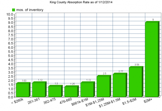
Now let’s talk about how inventory can be UP a bit on an overall basis and still be non-existent for MOST home buyers. The graph below illustrates this fairly well. Until you get to a million dollars, EVERY segment is running at less than 2 months of inventory. I would venture to say that probably 80% of those are homes no one wants…or someone would have bought them, except for the 20% or so that are very new on market and some of those are coming out the gate overpriced as well. Most sellers can still sell their homes in a week or less if they really put the right effort into selling their home, and keep the price at no more than 5% over the comps. So it goes without saying that for most buyers…there is nothing to buy.
As soon as something good that is priced right comes on market…still multiple offers after the interest rate increase to 4.5%. I haven’t witnessed it first hand so far in 2014 given it is early in the year, but that was the case throughout the 4th quarter of 2013, so no reason to expect that to change now. With less than 2 mos of inventory starting out the year, not likely we will get to any type of equilibrium as to sellers and buyers at all in 2014 except in the highest of prices. Even then…not so much in places like Clyde Hill where highest of prices still sells very well. More on that in the third price graph.
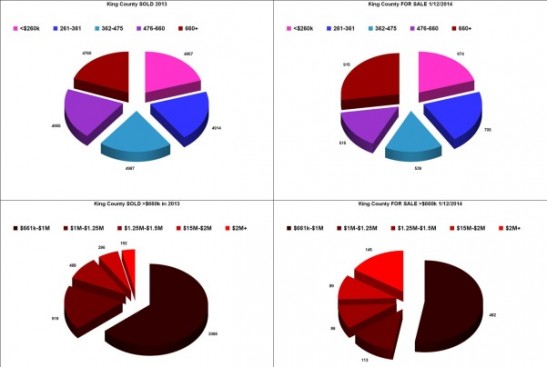
To better understand the absorption rate bar chart and why the price breakpoints appear to be “odd”, see the pie charts below. First using 2013 sold homes I broke the market into 5 pieces. So the first column above represents 20% of King County buyers. Each of the second, third and fourth columns also represent 20% of home buyers.
That puts 80% of buyers in the 1.25 to 1.63 months of inventory range. 80% of people looking to buy a home are looking at less than a two month supply of inventory and in many cases a 2 week to 5 week supply of inventory. Subtract the houses that no one wants…and you basically have NO inventory for 80% of the people looking for homes.
ALL of the last FIVE columns represent a breakdown of only the top 20% of the market. This in an effort to see where the inventory actually starts moving up.
It is not until you get to TWO MILLION and up that you actually see a buyer’s market. Everything up to $2 Million is a Seller’s Market at less than 4 months of inventory and for more than 80% of buyers less than a 2 months supply of inventory. Now let’s drop down to the last graph and check on home prices.
One of the reasons I check the stats at the beginning of each year is to test both my perception and also things I have been hearing and reading.
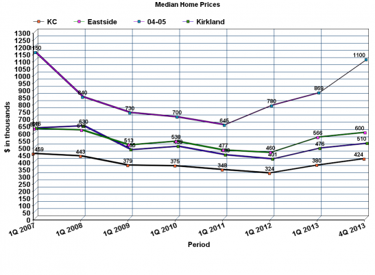
My perception was that Bellevue 98004 and 98005 were taking off like a rocket last year! To check that I added stats for just those two zip codes to my King County median price line graph. It is the purple line at the top with the light blue squares, and yes, my perception was correct. Up way out of proportion to the rest of the market. But the earlier part of the graph also showed a steeper decline which looked like “the bigger they are the harder they fall”. Still…almost back to peak pricing in 98004 and 98005.
The County as a whole also way up toward all time highs. Not quite there, but looking pretty “recovered” for now. As usual I am not really just “writing a blog post”, I am doing my own early work for my business. So in that regard I have to see how Kirkland, Bellevue and Redmond are generally faring compared to the County as a whole.
I need to study what is going on with Kirkland stats. For the Eastside line (green with pink squares) I combined 98033, 98034, 98011, 98052, 98004 and 98005. Not all of “The Eastside”, but a good balance of representation. It might make more sense to throw in more of the Bellevue Zip Codes instead of one of the three Bothell Zip Codes, but you can’t do that if you are going to track prices back to 2007. Kirkland, the blue line with the light blue squares, starts running under the main Eastside line. This because most of the large land mass annexed by Kirkland in 2011 was lower priced than the Kirkland before annexation. You see that dip between first quarter 2011 and first quarter 2012 when the median price went all the way down to $401k.
Considering that dip…for Kirkland to be back up to $510,000 is really quite amazing. I thought maybe the higher priced 98033 was carrying all of the increase similar to the big swing in 98004 and 98005. But not so. I tried to add that line here, but it just made the whole chart too confusing with all of the numbers overlapping. But the amazing part of the increase in Kirkland (which looks like a decrease because of the added properties) is that much of the increase happened in the annexed areas, especially in that part of Kirkland 98034 that used to be Bothell 98011. Back to why I added Bothell 98011 instead of more Bellevue Zip Codes. The later stats for Kirkland would automatically pull in some of what used to be Bothell 98011 prior to 2011, so the best answer was to keep all of 98011 in all the way through.
A little more explanation and graphs including Absorption Rate Data for Kirkland 98033, 98034, Redmond 98052 and Bellevue 98004 and 98005 in these links. Again just stuff I was working on for my own client reasons.


