2012 More Homes SOLD = Fewer “for sale”

Lots of talk about Low Inventory since Jan 1 2012. Most suggesting that there are fewer sellers who want to sell, or are able to sell. I’ve yet to see anyone point to the obvious conclusion…that fewer are “For Sale” because more “Have Sold”.

Looking at the 1st 6 weeks of 2012…yes inventory is much lower than 2009, but then 79% more homes have sold in the first 6 weeks of 2012 than in the same period of 2009. Result? Fewer are For Sale becasue 79% more have Sold.

graph (25)

Given the Tax Credit boosted the number of sales from 1,114 in 2009 to 1,669 for the same period in 2010 , to be riding 19% higher than 2010 without a Tax Credit is pretty significant.

graph (26)

When you strike a number for Standing Inventory at the end of a month and say it is “low”…remember to add back all the properties that have sold during the month.

Often fewer are For Sale…because someone else bought them.

********
King County – All Residential Property – Stats not compiled, verified or published by The Northwest Multiple Listing Service.

Can Seattle Home Prices Drop “Another” 22%?

Can Seattle Home Prices Drop Another 22% was a question raised by many here in the Seattle Area, after Zero Hedge posted the Goldman Sachs forecast for Major Cities showing Seattle at a 22% drop by year end 2012. After calling for modest to almost no declines in several major cities, Goldman predicted a 22% drop for Seattle with the 2nd highest drop being only 12% in Portland, and even a 7% gain for Cleveland Ohio and a 5% gain for San Diego. That would put Seattle at minus 27% compared to San Diego for the same period.

You can pick up Goldman’s rationale or lack thereof in that first link, we’ll stick to how likely it is that Seattle could drop “another” 22%. First let’s take a look at where a drop of that size would takes us, in the graph below.
graph (1)
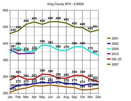
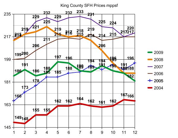
Important to note that I made a slight modification of the raw data for the graph above to account for modest home size variances, equalizing the data as to size of home or price per square foot. The closest rounding point was a median sized home of 2,000 sf. The data is in thousands, so top left in January of 2007 would be $430,000 median home price for a 2,000 sf home and bottom left would be $253,000 for a 2,000 sf home in January of 2001.

I posted a full chart of all of the raw data for those who want to create their own charts and modifications showing actual median home prices for the years in the graph above, median square footage of homes sold in each 30 day period and the # of homes sold. This is for Single Family Homes vs. Condos and King County vs. Seattle Proper.

Back to the graph above in this post. The top line is Seattle Area Peak in 2007. The turquoise and purple lines are “where we are” in 2009 and 2010 without significant difference except for seasonal variances in that 18 month period. I ended these graphs and the data at April 30 2010 due to the switch out of mls systems locally, but am seeing reports that May came in above April at $379,000. So the raw data suggests there is the normal seasonal bump up in May, as additionally influenced by the final tax credit closings which will continue until after June closings, and possibly slightly beyond.

The red line is the hypothetical Goldman Sachs prediction scaled against 2009 data at 22% below in each consecutive month.

********

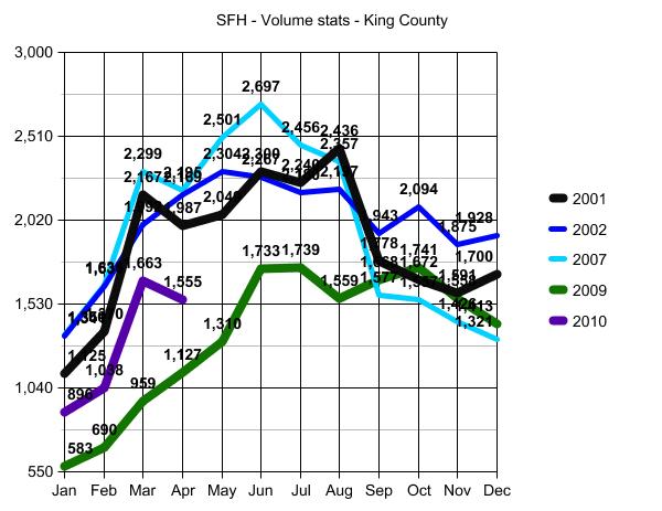
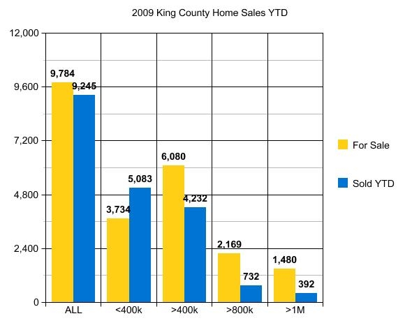
Before moving to conclusions, we need to visit the volume stats (graph below). I have been tracking volume for years in addition to price per square foot, as volume signals recovery or not more so than home prices alone.

graph (2)

Analysis is dependent on rationale of which data to apply, and for my purposes I have been using 2001 and 2002 as “Base Points” for two reasons:

1) 2001 is the earliest I will go when tracking home price and volume data, as Credit Scoring as the primary focus of lending pre-approval guidelines and risk-based pricing, was not a factor in the 90’s. Keeping apples to apples as to the number of people who can qualify to purchase a home, 2001 is a good start point.

2) 2003…toward the end of 2003…was the beginning of ZERO down/sub-prime lending standards. So all years from 2003 through mid 2007 will include an extra bump up as to volume and price created by that loosest of lending standards.

For both of the reasons noted above, it has been my long standing premise that volume of homes sold should be and can be expected to return to 2001 and 2002 levels as to number of homes sold.

One caveat: The number of condos built between 2001 and present is beyond proportional. Those additional “residences” in the form of condos and lofts in the Seattle Area will rob volume from the single family stats in some, and many, areas.

Note: In the second graph above, the volume of homes sold in October of 2009 (green line) exceeded the number of homes sold in October of 2001 (black line). This may not seem like something to view as a positive sign. But given the tremendous drop in volume as noted in January and February of 2009 to unprecedentedly low levels, surpassing 2001 volume stats by October of that same year was HUGE. Of course these numbers at both ends are influenced by the short breaks in the tax credit for home buyers in both January of 2009 and October of 2009…but still a significant signal reflecting that volume has the opportunity to recover to 2001 levels. NOT to 2007 levels! Volume cannot and will not recover to 2007, nor do I expect prices to do so until 2018 at the earliest.

Those who are waiting for a return to 2007 as to price and/or volume would likely have better luck betting on your favorite horse.

********
So, just how low will Seattle Area Home Prices go? Well first off let’s acknowledge that Seattle Area Home Prices WILL go DOWN. That seems obvious to me from the RAW DATA, but amazingly I still see many people questioning whether or not the market will go down at all from here. Hard to believe, but yes, some think the current level of $379,000 median home price is going to go up and not “EVER” down from there. One would think the credo of “home prices will never go down” was dismissed along with The Easter Bunny…but no. Some are still looking for a V-Shaped or U-Shaped “Recovery”. Sad but true.

A- Home prices will most assuredly drop by 4.3% in the very near future and likely by 4th Quarter 2010. (See blue square in the RAW DATA link above.) That is where home prices were in March of 2009 before the tax credit was renewed. So seems obvious without the credit, that is where prices will go back to…and likely lower than that without a new tax credit to prop up prices from that point forward.

B- The Tax Credit was meant to stop the downward spiral and eradicate the portion of loss created by momentum and NOT the portion of downward spiral created by fundamental economic problems. It was to eliminate the Fear Factor and the over-correction. Not the market’s legitimate decline point. Consequently the “safety net” being removed is going to create an additional drop of at least 5% in addition to the 4.3% drop noted above, which would take us to a drop of 9.3%.

C- Goldman Sachs is incorrect in its analysis of a 22% drop, because they do not apply the above A and B factors to all Major Cities. So their basic rationale is not credible, nor the number that emanated from that incorrect rationale.

D- Near the end of the time frame for the tax credit, home buyers were not as likely to enter into contracts with short sales and to some extent even bank-owned properties, for fear they would not close on time. Consequently, the median home prices were overly weighted to the high end of my bottom call. The mix of property from here through year end is going to push more toward the 37% under peak of that same bottom call vs the 20% side of the equation, with more “distressed” property in the mix. Not because of increased foreclosures, but because of more people being willing to buy them without a drop-dead-must-close date via the tax credit. It’s really just common sense, and pretty much a given.

Look for a 9.3% drop at some given point between now and the end of 2011. That would be any month in that period with a median home price of $343,753 or thereabouts.

As to 2012??? I expect a significant impact on price, with further declines, stemming from continued layoffs between now and the end of 2012 on a fairly large scale. But this last prediction borders on “the crystal ball method”. So let’s end with a 9.3% drop from $379,000 median King County home price by year end 2011, with an added caution that significant improvement to 2007 price levels will not likely happen before 2018.

In other words…”EXPECT the worst; HOPE for better than that.”

(required disclosure – Market Observations and all stats in this post and the graphs herein are the opinion and “work” of ARDELL DellaLoggia and not Compiled, Verified or Posted by The Northwest Multiple Listing Service.

Don’t blame the Agent…if you are impatient.

There are a million articles written on the Top 10 Mistakes that Home Buyers make. Today…the biggest mistake one can make is to set a rigid time frame as to WHEN you WANT to buy. Let me re-phrase that in light of the email I just received below from someone who is not my client.

“Ardell, I am seeing many sellers hanging on to those 2007 prices. I mean wouldn’t being 12% below a 2007 purchase price be considered a little high? Properties are closer than ever now to late 2004 pricing aren’t they? Many houses we look at have asking prices higher than what sellers purchased them for in 2005 or later. I’m really getting tired of this.”

First let’s review the data again.
graph (43)

King County median home price is/was at $375,000 a week or so ago, up from $362,700 as of the end of March 2009, and WELL above “late 2004 pricing” of $337,500.

I’m not saying prices won’t get to late 2004 levels. In fact I think they will get there or pretty darned close in some, though not all, areas. But to go out EVERY weekend…looking at homes and hoping they would now be at 2004 pricing when they are not, will result in your “getting tired of this”. It would be like my getting tired of my diet for not having lost 20 lbs this week. I know that’s going to take some time, and getting “tired of this” is NOT an option if I am to achieve my goal by my daughter Tina’s wedding date in October 🙂

Now let’s see how the numbers fall in different areas vs. “King County” median prices:

98052
Late 2004 median home price = $409,995 – April 2010 = $610,000

98006
Late 2004 median home price = $507,000 – April 2010 = $591,500

98033
Late 2004 median home price = $469,000 – April 2010 = $479,000

98103
Late 2004 median home price = $400,500 – April 2010 = $435,000

98038
Late 2004 median home price = $281,950 – April 2010 = $299,950

98023
Late 2004 median home price = $244,975 – April 2010 = $249,225

98109
Late 2004 median home price = $598,500 – April 2010 = $460,500

98125
Late 2004 median home price = $319,750 – April 2010 = $360,000

Some surprising results there, and in many cases those numbers come up VERY differently than what I have been seeing touted in recent news articles as to which neighborhoods are “stronger” than others these days.

There are different reasons for these results in the different zip codes. For example, if you are hoping for 2004 pricing, but are buying a house that did not EXIST in 2004…well, in some areas new construction is not likely to fall into the level of a home built prior to 2004.

One thing “the comps” don’t tell you, is how FAR the MAJORITY of home buyers has shifted from 2004 to present. How many are buying more reasonably priced homes where they can afford to put 20% down and get a 30 year fixed mortgage based on conservation ratios, as example.

It’s not ALL about “the market”…nor is it ALL about “this house”. First step is to know exactly where the area you are looking in falls…and if NO SELLER “wants” to price there…you may just have to stop looking for awhile. Looking for “best price” in May of any year, is not particularly realistic. It is what I call “The Season of Hope” and “Hope Springs Eternal”. Best prices often don’t happen until around October 15th in any given year.

Start with a realistic objective and DO NOT WEAR YOURSELF OUT looking and looking. Take your time. Pace yourself. If lowest possible price is your objective…”Spring Bump” period may not be the time you want to choose for being in your new home. Buying in August – September – October may be a better bet if you want “better pricing”, especially if no new housing stimulus packages are forthcoming.

Remember…”Patience is a Virtue” and one often has to fight their initial gut instincts, in order to become “virtuous”.

(required disclosure – Stats in this Post are not compiled, posted or verified by The Northwest Multiple Listing Service) They are hand calculated by me, and April medians may include the first few days of May before we switched to a new mls system. I used 4/1/10 as the start point…but no end date, since the system stopped updating data around May 4th and converted to the new system that does not provide similar statistic gathering capabilities.

The End of The World…as I know it.

Sunday Night Stats – King County, Seattle and Eastside

Ardell_aug-kcWhile I am not seeing any huge surprises in the market overall in King County, there were some jaw-dropping results in individual neighborhoods.

Amazingly great results from Downtown through 85th in both the first and second price tiers.

Amazingly poor results in Kirkland’s 98033 vs 98034 zip codes.  Those areas are usually reversed in terms of performance.

Redmond did not perform as well as they did last year. Bellevue only doing well in the lowest price tier.

All of King County still struggling in the over $1M market, with no exceptions.

The clear winner by far shown in the 2nd graph here, as compared to other parts of Seattle and the Eastside. Those figures of only 133 for sale in the lowest price tier, with 455 sold YTD, is beyond anyone’s wildest dreams for this market. My guess as to the dismal results for 98033 is that most of the cheapest homes used to be sold for lot value…and there are few takers for building lots and tear downs these days. The remainder of the problem is likely that homes are just overpriced, and buyers are getting much better at finding true value, vs negoatiating off of list price. This is sending the 98033 buyers into 98034 for better values and larger and nicer homes for the money.

I will be doing some in depth studies of the neighborhoods from Downtown through 85th to see if Queen Anne is outperforming Capitol Hill or if Fremont is outperforming Green Lake. Overall…as a group…clearly the best neighborhoods in terms of consistent performance which could be the hedge one is looking for against further price declines.

(Required Disclosure – The data used in this post is not compiled, verified or posted by The Northwest Multiple Listing Service. Hand calculated by ARDELL.)

Ardell_aug_dt_-_85

Sunday Night Stats – Seattle Area Home Prices

Earlier tonight I calculated some current results comparing the Spring selling Seasons of 2005 through 2009.  The results are fairly redundant and not much changed from my bottom call back in February. I did some detailed stats for Woodinville and Greenlake-Fremont 98103, and there are not many changes or surprises. My call of 20% under peak pricing unless it is a short sale or bank-owned property, is continuing to hold, and I expect that to stay the same for at least a couple of years.

In 98103 one surprise was as to volume sold between single family homes and townhomes. With the decline in single family home prices, the volume of those sold did not decline from last year, in fact it increased slightly at the expense of townhome sales. (Caption on the graph should be 98103 Median Sold Price) and that excludes the townhomes. Towhomes are running at $338,000 vs. $429,475 for the same period last year.

I would expect prices to fall at some point doing the 4th quarter, as usual, and then next year’s Spring Bounce period to run at about the current levels.

98103

(required disclosure by NWMLS: Stats are not compiled, verified or posted by The Northwest Multiple Listing Service)

Are sales really “failing” to sell?

(From near the end of this post: “Looks like of the 1,081 combined pendings since 6/1/09, at least 21% are short sales. But of the 1,379 closed in 30 days, less than 2% were closed short sales.”) Read full post for more info. That indicates a HUGE failure rate on Short Sales, though some of the variance could be attributed to other factors.

It seems that since the mls removed STI (subject to inspection) as a status, more pendings are failing.  Is this partly because we are now counting the same property twice, and so only 1 closing for 2 pendings in many cases?

1) IF it is first “Pending Inspection” or “Pending Feasibility” study – Every house that is put into “pending subject to inspection” will “fall out” into “pending”, before it goes to “Closed”.

2) Likewise a large number of bank-owned sales are previous listings that may have been pending as short sales.  They DO sell, but by the bank seller vs the owner occupant seller. The house IS sold at the end of the day. We are just showing two pendings for that one sale, with one closing and the other one “failing”, due to the change of seller name from owner to bank.

The only way for us to know this is to track them differently going forward. There is no way to get prior stats of the switch out from Pending Inspection to Pending or failed short sale = closed bank-owned sale, without looking inside each transaction by hand.  Too cumbersome.  But in recent history I believe these are clearly marked and can be identified for individual study, so if we begin now, we should have some really good data as time moves forward.

Today is the first day of the rest of our…research. Let’s begin on the “right foot”.

I’m going to go to the beginning of June, assuming anything that “went Pending” on June 1 hasn’t closed yet.  We can turn it into graphs after several weeks of raw data are obtained. Sticking to “Residential Only” (which in Seattle includes townhomes and on the Eastside does not, by and large). Most stats available are for SFH, such as on Seattle Bubble, so I will exclude “condo” and other types of property. I will also exclude manufactured/mobile homes and houseboats, which may have different #fail as to finance issues.  There is also a status called “Pending BU Requested” which indicates the agent is thinking the buyer in escrow may not close and is looking for BU offers.  I am going to show them separately as they don’t “fall out” into another Pending status before going to Closed…but should indicate a higher expectancy that the sale will fail.

In future posts containing these Pending stats, I will link to this post and not repeat the parameters each time. If anyone disagrees with the parameters, speak up so we can make the changes at the beginning together.

King County: Went Pending since June 1:

Pending = 456  (PI – 499, PF – 6, PBU – 120)

Note: a property can’t have two statuses at the same time.  So the 456 “true” pendings, are not also contained in the other categories.  PI used to be STI-subject to inspection. PBU is generally reserved for properties expected not to close with the current buyer who is in escrow. PF always had a high fail rate as the buyer is saying I only want to buy it IF…”. PI and PF should eventually move to “Pending” and only counted there. PBU we will try to break down further:

89 of the 120 PBU (Pending BackUps) are noted as “Short Sales”

7 more appear to be short sales, but some with prior lienholder approval

Many of the remaining properties in PBU are also short sales, but the field is new and some are not yet using it properly, especially if the property went pending since 6/1/09 BUT was listed long before the SS field was implemented. This data should improve over time. For now note that MOST of the 120 PBUs are Short Sales.

In addition, at least 135 of the 499 Pending Inspections are Short Sales.

Closed in the last 30 days – 1,379

Best I can tell, given pendings are closing in longer and undertermined timeframes, we can’t study a relationship between recent pendings and closed sales. Unless someone has some ideas here.

But at least we can track and see if the “true and full” Pendings are increasing or decreasing, if the short sales are increasing or decreasing.

Let me check for one more thing.  How many of those closed sales were noted as Short Sales. WOW! only about 24.  There you go…as I’ve said before, A Short Sale is not necessarily for sale!

Looks like of the 1,081 of combined pendings since 6/1/09, at least 21% are short sales. But of the 1,379 closed in 30 days, less than 2% were closed short sales. I’m going to leave this here, but also bring it up to the first paragraph.

Now that you can see how we will be able to break down the stats into the future, your thoughts on meaningful arrangement of data much appreciated.

Seems to me we need to note closed since 6/1 here (451) as Pendings will drop as they are Closed.

The primary purpose of this post is to show you what data is available, so that you can request a customized format in the comments below this post. (I am going to tag this “Sunday Night Stats”, just so that tag will pull up the full year and a half of my data related posts. You can get more data in this link of Tracking the Market.)

Required disclosure Stats are not compiled, verified or posted by NWMLS

UPDATE: I am compiling median prices and price per square foot of “normal” sales vs. short sales and bank owned.  I just found a drop down vs. check box for identifying bank owned properties.  … link HERE to the additional data . Breaking it down to North King vs. South King. There is a huge variance in pricing and the distressed sales are not dragging down other property sales “to their level”. Though I do think as time goes forward, identification of distressed sales will be more and more accurate as the new required field is used often and properly from here forward.

Sunday Night Stats – More bang for your buck

Relocating to Seattle: Home Prices (King County only) by School District – I’ll start with the graphs:

split-entry-eastside-graph

mppsf-sd

I spent a considerable amount of time this weekend working on home prices by school district for a woman on the East Coast who is hoping to move to Seattle with her family. 

My conversation with her touched on something that is very common, though not talked about much on real estate blogs.  The reality that husbands and wives often disagree on priorities. Consequently you end up with a “want” list that can be near impossible to fill as in: wife wants a new kitchen and new baths in the best school for the children.  Husband wants a single family home with at least four bedrooms and a yard for $350,000 or less.

It is very difficult, if near impossible, to search by school district on the internet. Narrowing it down to specific schools in a school district is even harder.

I started a series of posts by calculating the price variance of homes in six school districts. At the onset I eliminated homes over a million dollars and homes with lake or mountain views, and came up with these results as shown in the middle graph above.  In order to evaluate where prices are currently vs. in previous years, I used March, April and May stats back to 2005, as I can’t search by school district prior to late February of 2005 as is explained in the linked post.

Next, I took the same timeframes but stuck the median of the three months combined (vs. separately) for each of those years as shown in the last graph in this post and explained HERE.

The 2009 data in the second graph above peaked my curiosity regarding the consistent spread between school districts seeming to go haywire in 2009, with half the school district home prices turning up and half turning down. While that may appear to be the market being “flat”, in reality UP vs DOWN does not equal “flat” to most home buyers and sellers, as they don’t get to average the two when buying or selling a specific home. That led me to this post and the graph below, to sort out median price changes from December of 08 to present.

Remember, these are school districts vs. cities, so part of Bellevue is in BE (Bellevue School District) and part of Bellevue is in LKW (Lake Washington School District). ISS is Issaquah School District, not the “mailing address” of Issaquah.

Given the recent inconsistencies, I moved to find a like kind product that fulfilled the “4 bedroom with yard” parameters of a family with a couple of children hoping to buy “a single family home $350,000 or less” in most of the available school districts, and came up with the split-enty or bi-level home (not split level home) described in this post.  It has long been one of my favorites for “More Bang For Your Buck” and as the first graph shows, the same house can be had at different prices in various school districts.

The first graph tells you a lot.  If you want the house with lots of upgrades for around $350,000, you more likely can get that where the median price for that style is in the $350,000 or less range.  If you choose a school district where that home normally sells for much more than $350,000, you can still get that house, but you might have to sacrifice that newer kitchen or newer bathrooms as a trade off for the school you choose.

There is always a lot of controversy when discussing schools and which may be better or best. Consequently you don’t see much of that discussion anymore.  The reality is that people who are relocating from thousands of miles away, look at homes on the internet, AND they try to choose schools using the internet.

Hopefully all of the data I put together will help one Mom and Dad sitting in DC with their current decision making process.  As is my practice as a real estate blogger, I try to show you how I work for each client or potential client, and give you the benefit of seeing my thought process and the underlying data.

Last but not least…I know it isn’t Sunday :), but I try to tag all of my stat related posts here on Rain City Guide as “Sunday Night Stats” and on my blog as “Tracking the Market” so that people who like to follow those posts as a category, can do that via a one click link on both sites.

Hope everyone had a great Memorial Day Weekend!

(required disclosure) Stats are not compiled, verified or posted by NWMLS

Sunday Night Stats – Bottom’s UP

For those who are just tuning in, Sunday Night Stats is a continuing saga that I started back in early January of 2008.  Each week is a small piece of the whole, and often shows only those changes that were revealed in the week between posts.  For a longer perspective of the Seattle Real Estate market, click the category for “Sunday Night Stats” for other posts in the series.

Last week I did a brief Snapshot showing that home prices appeared to have increased by as much as 10% in a very short period of time. This week I was testing how sales were doing in comparison to the new 2009 Assessed Values.  Up until very recently, the mls was giving us the 2008 Assessed Values.  Most people know that I use these in conjunction with other valuation techniques to determine offer prices for my buyer clients. As soon as I noticed the change to 2009 values, I started studying the relationship of the most recent sales to these new valuations.

To my surprise, the same 10% increase in prices appeared!  I tested late 2008 and early 2009.  I then tested the period immediately preceeding the escrows that would have been entered into just prior to the $8,000 Homebuyer Credit being passed.  The 10% increase happened in a two week period AFTER the credit passed (allowing 30 days or more for those escrows to close).  Given the % increase is the same as last week, using a completely different method, it seems pretty certain that the stimulus is stimulating more than we expected…but it could of course be very temporary.  Time will tell.

Before you do this at home, see the end of the post after the charts.  I will give you a few tips on how to utilize this type of information around any home you are making an offer on.

(Note: During this same time period of “increase”, “bottom” prices are still available on many homes.  3 buyer clients of mine achieved prices of  86%, 83% and 77% Of 2009 Assessed Values, during this same timeframe showing the Average at 100%.  “bottom” is not a month or a day.  Every day homes sell at different prices and different values. You do not “miss” bottom.  You just have to be willing to find it OR make the choice that you don’t want it. Many people can afford to have their dream home and don’t want to deal with the tradeoffs of buying “at bottom”.

Bottom is not something you wait for, it’s something you put the extra effort into finding…or not.

2009-end-of-march-beginning-of-april

A few notes.  I entered dates at the end of March of 2009 and the beginning of April 2009, until I had about 10 homes.  I did not pick and choose the homes to conform to an answer I was looking for.  I simply closed the dates when the desired # of homes was obtained.  Of course I’m using a small geographic area and the same area is used for all charts, with different timeframes.  I did eliminate new construction, as Assessed Value information is not always available for those immediately after closing.

What you may find to be of particular interest is the Days on Market (DOM) and % of Asking Price, is not as good of an indicator of value, nor a reliable one.  Review all three charts for all three periods (one is in a link at the end) as I think you will get a lot of tips on how to price and how to make offers, by studying the results of many people’s attempts at different means of pricing .

2009-seattle-area-home-prices

The results are really pretty much irrefutable, but just to be sure, I did a third set of data for closings immediately prior to the 30 day period following the Stimulus Package being passed.  The values were slightly lower…the increase was ONLY in the very short period of time after the credit was passed.  Pretty amazing results.

To convert the data to your specific area, simply gather the same information for sold property in a radius around your home or the home you plan to make an offer on.  You might not be able to get OLP (Original List Price), but I think the results here show that using that as a basis is not all that helpful.  The rest you should be able to get from Zillow or the King County Parcel Viewer, or a combination of both.

If you want the detail chart for the period at the end of February and early March, closings that were entered into before the credit past, CLICK HERE. The Average % was slightly under the second chart in this post for late 2008/early 2009.

Sunday Night Stats – Snapshot of “bottom”

Revisiting my “bottom call” of February 7th.  At the time, even those who potentially agreed with me, wanted more “proofs”.

But in the instant that I “called it”, it was more like watching the horse at Steel Pier diving into the ocean.  You knew the horse was going to land UNDER the surface of the water, even while you were watching it in mid-air.  Basically, the market was taking a high dive off of the beginnings of “spring bounce”. It was like standing on a train platform and watching a bunch of people jump in front of the train.

For those who don’t like to believe that the Housing Market Stimulus Package is going to improve the market, you may take some consolation in the fact that the same stimulus package contributed to “the bottom” call.  The mere hope of thousands of dollars coming, created the instantaneous and abupt change in the marketplace that caused “the bottom” to happen. So you can both credit the Obama Administration for the “recovery” and also blame them for “the bottom”. That should satisfy just about everyone.

Here’s the final snapshot of what I believe is “bottom” and the forces that created it.

snapshot-of-bottom


The green line is the percentage variance between asking and sold prices.

The shift down from 3.1% to 1% signalled the typical beginning of “spring bounce” in January of 2009. At the time of my bottom call, this percentage shifted from a low point of 1% to a high point of 5.5% almost overnight. You can see the historical data from just before peak to present, with some commentary in this post. The only other time the % variance of asking to sold prices exceeded this 5.5% mark was in February of 2008, BUT that was at a time of high asking prices

This brings us to the blue line.  What you are seeing in December, which is often the lowest point for prices in an given year, is a median asking price of $451,000 (for this market segment) being pulled by a 4.2% variance down to a sold price of  $432,000 and an adjusted median price per square foot down from $256 to $222. Then you see the normal seasonal ascent as asking prices increase (blue line) and the % variance decreases (green line).

Note the yellow dots. Even though asking prices stayed level from 1/1 to 2/1, the prices (yellow dot) increased because the % variance from asking price to sold price decreased (green line).  Watching asking prices rising and dropping does not give you the same perspective of watching that in conjuction with:

Median changes in Days on Market of homes sold

One of the most startling indicators that “bottom” was “in the room” was the insane shift in % variance of homes sold in less than 30 days.

% sold in 30 days or less

As you can see in the above link, the % sold in 30 days or less just prior to peak was 70%.  So it would seem to follow that the extreme low of 13% at the time I called “the bottom” would be “just prior to” bottom. While we don’t yet have all of the sold data for the month of March, the shift upward from 13% to 23% and March to date at 33% is a big sign sign that February 7th or so was and is likely “the bottom”. I find it very hard to believe that number will ever get lower than the 13% it was when I made that “bottom call”.

In writing posts in preparation for this “snapshot of bottom” post, I did visit the volume of sales statistics. But to a large extent I have stopped relying on this data and consider it very old news. The drop from peak as shown in the graph in that link from 181 in June of 2007 to 86 in the short period to September of 2007 was a huge signal that prices would follow. But today I rely less on volume statistics as a sign of anything, because with squeezed equity positions you find more and more sales happening outside of the mls system.  YOY volume is not only “old news” it is also mostly only relevant to agents vs. buyers and sellers of homes these days. Still I provide it for those who like all of the data.

Last but not least, let’s visit the plunge of sold prices in the chart below.

prices-hit-bottom


The chart above is where you get the fine tuned visual of watching prices take a nose dive off of Spring Bounce. Perhaps if you didn’t “get” my reference to the Diving Horse in the opening of this post, you can feel it now as you examine the variance in this graph from December of 2008 to March of 2009.  You can almost see the horse slowly climbing up the ramp (from $432,000 to $469,000), and then you gasp out loud as the platform falls out from under the horse as he plummets head on into the ocean ($405,000). My post of February 7th was me “gasping out loud”.

How I chose the market sampling bears some explanation. In my bottom call as detailed by Aubrey Cohen in his article in the PI:

“DellaLoggia said… buyers are consistently calling the bottom at 20 percent under peak pricing” (not including houses that are not in foreclosure or being sold as part of an agreement to avoid foreclosure)…she’s focusing on the North Seattle and East Side areas where she works. She said distressed sales were going for about 37 percent below peak, and areas with a large share of distressed sales would see those dragging down prices across the board.”

So to determine price specific to a subject property, one you choose to buy or one you need to sell, you need to calculate what peak price would have been for that property.  Then you need to calculate the % of distressed sales affecting value.

Since the drop in premium pricing for view property is dramatic in a down market (just as it is accelerated in a hot market), I excluded lake and mountain view property from this sampling. Since very large homes (mostly new or newer) are experiencing a different market influence which is not “at bottom”, I also capped the square footage in this sample to not more than 3,000 square feet.

Making those two initial adjustments, I used the zip codes of 98004, 98005, 98007, 98008, 98033, 98034 and 98052. This gives us both Downtown Bellevue and Finn Hill.  It gives us close to Microsoft and North Juanita.  It gives us an approximate mix of 10% distressed property to 90% not distressed property and it gives us a combined drop from peak to bottom of approximately 30%.

That 30% is a combination of the 20% and 37% quoted in Aubrey’s article,  an extreme reaction by sellers to jump in front of the train with deeply discounted asking prices and the buyers going after that deeply discounted group with a sickle chopping 5.5% off those lowered asking prices.

I did a final adjustment in the red line of this post to equalize the slight variance in median square footage of the homes in the monthly samplings, to be sure the results weren’t skewed by minor sold home size differences from month to month. This is noted as AMPPSF – Adjusted Median Price Per Square Foot.

One thing I know for sure.  It was a whole lot easier to write this original post, than it is to explain it. 🙂

Related posts:

RCG – The Bottom CallRCG Sunday Night Stats – At Bottom , “Agent Predicts Housing Slump’s Demise” – Aubrey Cohen, Seattle PI, My thoughts on Aubrey’s article, Snapshot of Front Page “above the fold”