Lessons from the Foxhole: A Nevadan Takes a Stab at Seattle’s Real Estate Future

joe salcedo[Editor’s Note: I get asked all the time if people from outside of Seattle can write for Rain City Guide and I always say no… I really like keeping RCG as a “Seattle” thing. However, recently Joe Salcedo of the Reno Real Estate Blog reached out to ask if he could publish a one-time post on RCG about his experiences with the Reno, Nevada market and the insights it might provide to the Seattle community… and I bit. I’ve published the article below. Enjoy! ~Dustin]

In August of 2005, our real estate market crashed.   It’s been five years and we’re slowly trying to get back on our feet.  I’m here to share some of the lessons I’ve learned along the way; the prodigal brother, if you will.

I started with a blank page.  One weekend after, baffled and fascinated and my curiosity violently piqued, here’s what I found out about your market:

  • If you waited until Seattle home prices went down in July 2007 (before you realized the market was having problems), you’re going to be at least one year behind.  Check for other signals. Home prices take too long to reveal itself profitably.

In Feb 2006, less than a year after the Reno real estate market crashed, I called an emergency meeting (coupled with other factors like plunging housing starts and declining home builder stocks) after being greeted by this chart:
Reno Home Resales
Yes, all markets are local but we all came from our mother’s womb.  Like a bearish stock market pulling down three out of four stocks with it – (both weak and strong companies) – majority of real estate markets fall with the general market.   Follow the home builder sector group in the stock market (Investor’s Business Daily tracks it every Monday). Check housing starts and building permitsto see a glimpse of the future:
Housing Starts Chart

  • For potential sellers: Consider cutting your losses short.  If you’re barely making it with house payments (perhaps using borrowed money just to make it) and hoping that the market would change soon, perhaps it’s time to think about making some tough decisions.  Distressed properties tend to pull home prices down further (see: notice of trustee sale graph below.)

If you’re comfortable with your mortgage payment (you bought a house on or before June 2005) and moving is too painful, it’s ok to stay; just know that based on present real estate conditions, it may take a few years before your house will appreciate from the price you bought it.

Percentage Home Price Change

Notice of Trustee Sale by Month Chart

(From SeattleBubble.com)

  • Short sales and foreclosures are like a mysterious disease that defies normal market cause and effect.  Inventory could be down, demand up, but price still down.  This has been happening in our market since 2007.

And like your resident queen, the author has made premature bottom calls by not taking into account the “black swan

How To Better Use the Internet to Find a Home

1) Make a “value grid” of the area you are interested in.

2) Overlay an Elementary School ranking grid (whether or not you care about schools).

3) Use steps 1 and 2 to define your “target area” and make a new chart highlighting Market Value’s relationship to Assessed Value in that smaller, defined area.

Before I demonstrate how to apply these techniques, some insight on why I am writing this post today. It is in response to a few comments I read in The Wall Street Journal’s article on Buyer frustration, namely:

“The mood among buyers was ‘nasty’…customers just keep getting outbid on the houses they want.” Glenn Kelman, CEO Redfin

“What’s selling is the Cream of the Crop, and they sell fast. What isn’t The Cream of the Crop is getting hammered.” Real Estate Agent in Florida

“It’s a false buyers market. If you think prices are cheap, wait until you start making offers.” 32 year old home buyer

The main reason you want to start your home search on the internet, is to formulate some strong opinions about what you DON’T want, especially with regard to over-paying for a home, before you step into the arena.

The tug of war in the Internet Home Game is that agents want you to just come OUT and SEE the house, hoping you will fall in love with the house, and not care so much about it being a “good value”. The homebuyer is refusing to GO SEE the houses that indeed might create this scenario, which will work out better and best for the agents and sellers than for the home buyer.

The Mexican Standoff is created by sellers pricing based on their house being somplace where it is NOT, and buyers making offers based on some overall market statistic that may or may not apply to the WHERE they want to live.

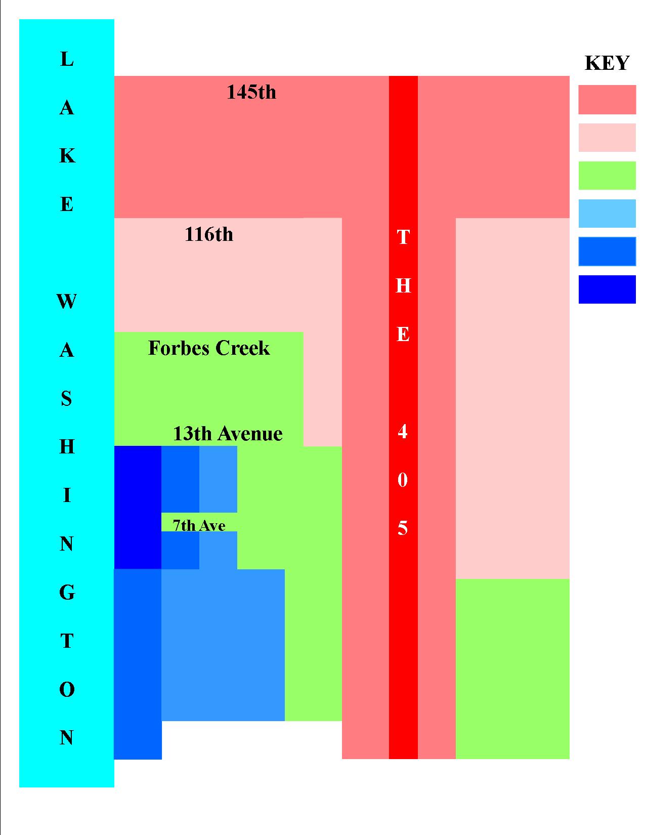
To demonstrate this technique I am using the City of Kirkland in the example, because it is one of the easiest to break down into its value segments.

VIP! EVERY area has these VALUE TIERS with sellers in the dark pink area trying to price like the light pink area and sellers in the light blue area trying to price in the dark blue area.

That is what “over-priced” means, to a large degree.

WARNING: Some severe Real Estate Transparency ahead. Agents generally do not convey this information publicly because it can be offensive to buyers and sellers in the lesser value tiers. While all good agents use these methods with their clients, there is good reason why they do not speak of these things publicly.

If you are a homeseller or agent who wants to pretend that the only factors are school DISTRICT and those that relate to the home itself, this is not a good post for you to be reading.

1) A “VALUE GRID” example
kirkland value grid

TO UNDERSTAND AND CREATE A VALUE GRID, YOU HAVE TO UNDERSTAND WHAT THOSE VALUES ARE PULLING TOWARD AND AWAY FROM.

This is likely the main argument for why you need “a good agent” unless you can use these techniques to represent yourself. This is why having “any” agent is not necessarily better than representing yourself. When I ask an agent what “his service area is” and he says “ANYWHERE!”, I know he is not a “good” agent.

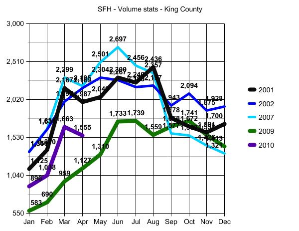
It is great to keep up on general market conditions, using sites like Seattle Bubble that tend to speak in terms of COUNTY stats. I read it all the time. BUT if you don’t take all that a step further into your area of interest, you will be the poor schnook who bought the house in the green section at a medium blue price and ended up selling it at a light pink price.

That is something that you need to understand about FORECLOSURES and why agents pay less attention to them being a “market value” setter. Sure, if someone buys a house in the green section and prices it at time of sale in the green range of value and it ends up in foreclosure, we all sit up and take notice! BUT, but, BUT when we see the house that sold for a medium blue price in the green section come back as a foreclosure…we say…”poor schnook, who the heck represented him when he purchased THAT!”

That’s how an agent can sometimes tell that a house is overpriced before seeing the house. That is why you need to know that too…so that you don’t fall in love with it and start ignoring “the obvious” from an emotional standpoint. The same holds true for the opposite, however. MANY BUYERS ARE FRUSTRATED because they keep making pink offers in the blue area…unsuccessfully. To go back on the quotes from The Wall Street Journal article, the “Cream of the Crop” is BLUE in all of its 3 shades and then Green. Getting “hammered” are the greens who bought at blue prices or the pinks who bought at green prices.

This applies to New Construction Foreclosures as well, and the builders who got the land in the green sections, but penciled their profit numbers out on the blue ones, or who bought in medium blue thinking they could get dark blue prices.

A few notes on the Sample Value Grid. I don’t want to get bogged down in the detail of “Kirkland”, but to help you use this principle elsewhere, worth a little more comment. The dark blue section is basically a condensed form of West of Market. Once you know this, you will understand why a lot of the bargains are up at 18th Ave to 20th Ave, especially on the West side of Market Street. The Medium Blue section to the right of the dark blue section is the other side of Market Street known as “The View Corridor” of East of Market which runs from 1st STREET to 3rd STREET (but not ON 3rd) and from Central to 13th Ave. The lighter blue section to the right of The View Corridor is East of Market up to 6th Street (but not ON 6th Street). The green section to the right of that is called “the wrong side of 6th” and can turn pink and green alternately depending on which street. Lots of “bad” decisions on highest priced homes “on the wrong side of 6th”. Same holds true in the lower sections where 6th Street turns into 108th Ave NE. You have to balance the COLOR grids (and school grid) with the “freeway noise” in some of these areas on the southern portion of the grid in the blue and green areas.

The lines are not hard and fast, but understanding some basic valuation principles will help you understand “value” better and well enough to “bend” the lines when appropriate.

AGAIN…EVERY AREA HAS THESE COLOR GRID FACTORS!. They just differ as to where and why in each area.

********

2) Overlay the ELEMENTARY SCHOOL GRID

This is a newer value increaser/inhibitor somewhat created by sites like GreatSchools.org and sites like Redfin using those rankings on its property detail pages down near the bottom. People always had a word of mouth “best schools” impact on home values and rankings of School District and High Schools. But the valuation demarcations based on ELEMENTARY school and the exact “borders” of those schools, is a relatively new phenomenon created by more information being available on the internet.

Knowing the school boundaries is great! But are we giving too much credence to sites like GreatSchools.org and SchoolDigger.com? Most real estate industry personnel say yes, and do not lend their seal of approval to these sites as readily as some newcomers to the industry. That said…there is some overlap between the school rankings and the traditional value segments. Most BLUE areas happen to have good schools. Some pink areas do as well. So to do our overlay, we don’t have to decide whether or not the school rankings are 100% accurate any more than we have to decide if green is better than blue.

Remember, if you can’t afford blue…green may be your best option and if you can’t afford green, pink in the best school may be your best option. OR pink with a great school might be better than green with a lesser school. OR…as pink gets darker toward another school district…a better school in the OTHER school district may be a better choice. These are the kind of things you need to consider when choosing an agent or choosing to represent yourself. Recognize these factors as “real” and learn from where the foreclosures exist and why those foreclosures happened.

That’s why you have to know why these areas are “colored” as such, and what they draw their value from. The upper pink section on the left is pulling from Bothell and Northshore School District vs Lake Washington (the lake itself) and Downtown Kirkland, as example. You might want to step over that line…or not.

If you take The School Boundary Map and overlay it on the VALUE GRID you will not be surprised to see the Dark Blue area serviced by a highest ranked school and the lowest ranked school planted firmly in Pink.

Life is not quite that simple and I’m not going to go there with you in this public forum. I give you the tools, you being a “reader” vs “my client”. There are limits to how much credibility I will lend to these ranking sites as a professional, and those limits are only shared with my clients. But hopefully, no matter where you are looking to buy, this shows why EVEN IF YOU DON’T CARE ABOUT SCHOOLS, you should not overlook the secondary value pressure of which elementary school is servicing the home you choose.

********

3) Market Value’s Relationship to Assessed Value in the “target market”

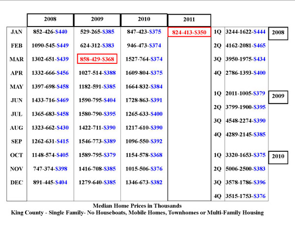
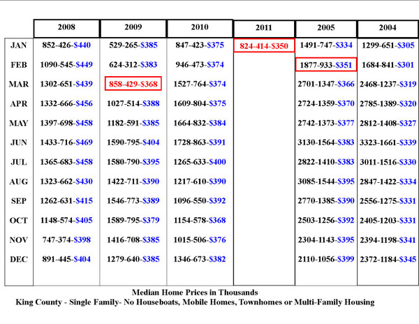
This is a little harder as you have to balance some other factors like land value, main floor footprint and home style. It looks something like the chart in the link just below this sentence, that I have used in posts before:

Market Value vs Tax Assessed Value

For a “target area” we will be blending steps 1 and 2 with this 3rd step, using the same color key as in the link above from green to red, which is different from Step #1 and it’s color codings. In this final step, lighter green is best (vs blue), but red is almost always a “stop sign” of some kind. 🙂

I’m going to lose a few more people here, but for those who are seriously needing to understand value of homes in order to pick one and make an offer…try to stay with me here. Be sure to click on that blue link just above marked “Market Value vs Tax Assessed Value” before moving on to the charts below.

COLOR AV CHART

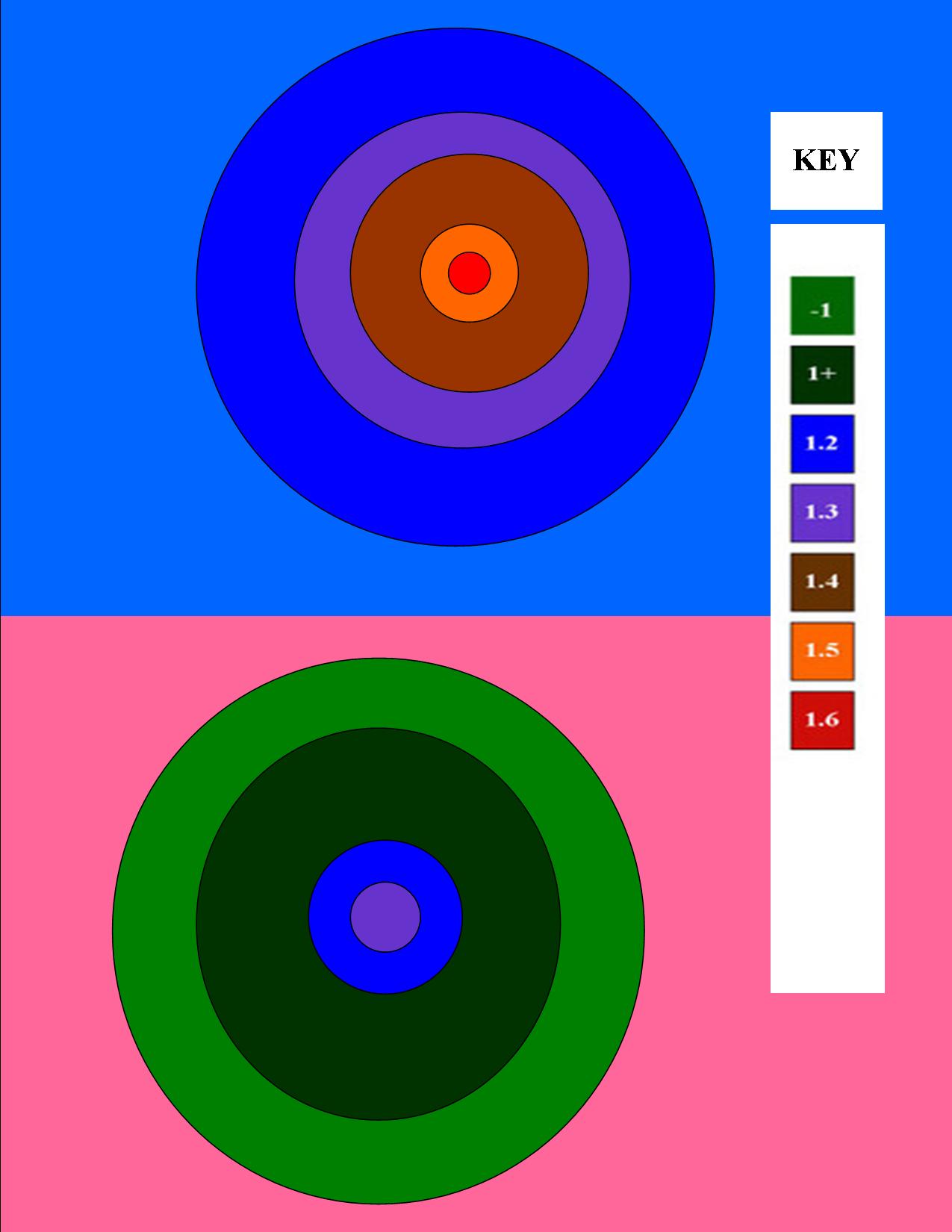
The BLUE background chart relates to point #1 and is a “Blue Value Grid Area”. In a Blue Value Grid Area, your best hope may be a Blue Price as noted in the KEY to the right, that being 1.2ish times Assessed Value. A few may even sell at the RED “bubble prices” if they are near water, have water views AND have been fully remodeled. You might find a green or two, but they will likely be “tear downs” selling at lot value.

If you are making Green offers in the Blue Zone….you may never achieve success UNLESS when you draw YOUR target MV vs TA map, there are some green sales.

The PINK background chart at the bottom also relates to point #1, but most of the sales ARE green and none are red. In this area you DO NOT want to buy in the purple or above zone without VERY good reason.

I’ll try to simplify this. Let’s say most houses assessed at $800,000 sell for $950,000 in the Blue Zone. NONE have sold for less than assessed value except for the tear downs, or busy road, or malfunction of floorplan issues. That means if you keep looking for a GREAT house with no negatives and making offers of less than Assessed Value, then you are going to get frustrated.

BUT if you are in the Pink Zone where homes sell fairly regularly at assessed value or less (you need to do the actual stats to know if that is the case, this is just an example of HOW to do that) then you don’t want to be paying 1.2 or more times assessed value or $470,000 for a home assessed at $390,000.

EACH AREA will have it’s own relationship to Tax Assessed Value. This has ALWAYS been true in the Seattle Area and is a much better valuation tool than Price Per Square Foot, especially in areas with basements.

You need to calculate if your area of interest is a .97 of assessed value area, a 1.13 times assessed value area or a 1.25 times assessed value area. NO “area” will be a 1.5 times assessed value area right now…but a given house may be.

I’m going to stop here as I’m sure I’ve lost quite a few people by now. But THIS is roughly how good agents “work”. They don’t necessarily make little maps that look like alien solar systems as I have here. But this is an attempt to convey to you the process of how an agent generally values homes and the property they sit on.

Feel free to expound on the topic by asking specific questions in the comments. I’ll do the best I can to explain further in direct answer to those questions.

Seattle Area Home Prices Hit New Low

King County Home Prices hit a new low in January of 2011. There’s definitely something a little odd going on, as median home prices do not usually fall by $32,000 in one month. But then November and December of 2010 should not likely have gone up as much as they did, unless the market is positioned to start ramping upward, which no one really expects to happen.

The only conclusion is the market is teetering on WTH to we do NOW! …or lot’s of people read my Oh NO! People are starting to overpay for houses again post.

No more tax credits, market should have gone down. But 2010 ended higher than it began. Totally unexpected and irrational.

Take a look for yourself. The blue $ is the King County Median Home Price in Thousands. The red blocks mark the bottom of the decline from PEAK Pricing in July of 2007 to March of 2009 and the second red block is where we are now at the end of January 2011. The first number in each 3 number sequence is number of homes closed. The middle number is the halfway point (median) as to units sold. Some are not exactly half as more than the perfect number sold at the same price to stop at exactly half sold for more and half sold for less.

Example: Jan 2011 824-413-$350 means 824 homes sold and 413 of them sold for $350,000+.

A NEW low!

bottom chart

The quarterly median graphs on the right above show you that in a flat market a year ends about where it started as to 1st and 4th quarter and the 2nd and 3rd quarters are usually higher. That is what they call “Spring Bump” and what a “normal” relatively flat year looks like.

Now let’s look at where King County Home Prices are BACK TO with this NEW LOW.

2004-2005 prices

NOT at 2004 pricing YET…but very close. A small $5,000 drop from here will put us at December 2004 level.

At the moment, as you can see in the above graph, we are at February 2005 pricing.

We had been running at or above April 2005 pricing for quite some time. For years…many years,and consistently for the last two years. So this new low is quite a “newsworthy” event.

I think we will “Spring” back up to $375,000ish pretty quickly…but for now, we have a new low. What will cause the rise up? Some people with really nice houses who are not upside down getting on market and listing their homes. There are more buyers today than there are nice homes, priced well, to buy. But I expect that to change, and for prices to get back up to the $375,000 level fairly quickly. If not in February, than by April at the latest.

********

(Required Disclosure: Stats in this post and in the charts in this post are not compiled or published by The Northwest Multiple Listing Service.)

How to find your “Dream Home”

Finding your Dream Home starts with determining if you can afford your Dream Home. Let’s say you have decided that you want a two story house, one with at least 3 bedrooms on the 2nd floor. Now add that you work at the main Microsoft Campus and want a home within a reasonable distance to work.

Start by taking out a map and drawing the area within which you would like to live. For the purpose of this example, I drew the map based on where most of my clients who want to live near Microsoft draw these lines. For example, most wouldn’t live on Finn Hill, so Finn Hill is not in this sampling. Most would not live in Bothell. So Bothell is not in this sampling. I can’t use a “radius” of the campus, as most don’t consider the other side of Lake Sammamish to be better than a little “further” in pure distance into Kirkland vs “around” the Lake. So I’m using a polygon, many sided, map area.

Your “mapped area” may vary, but use this as a guide, and apply to your own mapped area.

I’m using a “12 month rolling basis” here to include the most recent data and exclude the oldest data, and yet still have enough sales in the sampling to produce enough relevant data. For the most part it is 2010, but includes the most recent data available in Jan. 2011 to date, and excludes the oldest info from Jan of 2010.

Before you go out looking at houses, you want to begin with some reasonable expectations.

graph (26)

The Data above tells us that the majority of two story homes in the mapped area sold over the last 12 months existed in zip codes 98052, 98033 and 98004. Now let’s look at price.
graph (28)

I only used some of the data to produce this post. You can see the rest of the raw data HERE.

By using these simple techniques, you can easily see that you likely need to spend about $650,000 give or take and look in 98052 and 98033 primarily. But what if you want to spend $500,000 and want a home that is not older than 5 years.

Simple…just test that parameter.

98052 2-story built in 2006 or later sold in the last 365 days for $500,000 or less = one house.

98033 there was also only one house sold fitting those parameters, but it was far from being finished new construction. There is also one in pending. Both required cash buyers as the property was not in a condition that could be financed.

So now you have to ask yourself, is “The Dream” a “house” or a “home”? Do you change the “what” and look for an older home of a different style in a great neighborhood with a great school? Or do you up the price in order to get everything you want, if you can afford it, but didn’t “want” to spend more than $500,000?

Point is, you don’t have to go out to “look” for your Dream House before testing your Dream against Reality. Setting a realistic objective saves you time and maybe money as well. By staying home and making this decision, you may opt to keep the price low and change your expectations as to house. If you get too vested in the outcome of “newer 2 story house of not more than 5 years old”, you may start pushing on price to get “it”.

Consider all of the factors of “dream home” including neighborhood and schools, before getting your heart set on one particular style or age of home.

December 2010 King County SFH

There’s a big hoo-ha brewing over the December 2010 “increase” in home sales. Not to worry. It’s more of a “Lies, Damned Lies and Statistics” argument, than a true market change of any kind.
bottom chart

As you can see in the chart above, prices are still trailing along the bottom from the price in the red block of March 2009.

Volume for the 4th Quarter is higher than 2008 and lower than 2009. The December up is simply a correction for November down. That correction could simply be a matter of reportings vs actual closings OR it could simply be longer loan processing times throwing some November closings into December.

Don’t worry about the noise, but do worry that more home buyers seem to be overpaying for homes these days than they have been for a couple of years. There is no market trend that will cover up those kinds of mistakes.
********
Required Disclosure: The Stats in the above chart are compiled be ARDELL and are NOT compiled, verified or posted by The Northwest Multiple Listing Service.

Note: The primary variance in my numbers vs other reportings is that most count townhomes in Seattle but not elsewhere. I even that out by not counting townhomes at all.

Can Seattle Home Prices Drop “Another” 22%?

Can Seattle Home Prices Drop Another 22% was a question raised by many here in the Seattle Area, after Zero Hedge posted the Goldman Sachs forecast for Major Cities showing Seattle at a 22% drop by year end 2012. After calling for modest to almost no declines in several major cities, Goldman predicted a 22% drop for Seattle with the 2nd highest drop being only 12% in Portland, and even a 7% gain for Cleveland Ohio and a 5% gain for San Diego. That would put Seattle at minus 27% compared to San Diego for the same period.

You can pick up Goldman’s rationale or lack thereof in that first link, we’ll stick to how likely it is that Seattle could drop “another” 22%. First let’s take a look at where a drop of that size would takes us, in the graph below.
graph (1)
Important to note that I made a slight modification of the raw data for the graph above to account for modest home size variances, equalizing the data as to size of home or price per square foot. The closest rounding point was a median sized home of 2,000 sf. The data is in thousands, so top left in January of 2007 would be $430,000 median home price for a 2,000 sf home and bottom left would be $253,000 for a 2,000 sf home in January of 2001.

I posted a full chart of all of the raw data for those who want to create their own charts and modifications showing actual median home prices for the years in the graph above, median square footage of homes sold in each 30 day period and the # of homes sold. This is for Single Family Homes vs. Condos and King County vs. Seattle Proper.

Back to the graph above in this post. The top line is Seattle Area Peak in 2007. The turquoise and purple lines are “where we are” in 2009 and 2010 without significant difference except for seasonal variances in that 18 month period. I ended these graphs and the data at April 30 2010 due to the switch out of mls systems locally, but am seeing reports that May came in above April at $379,000. So the raw data suggests there is the normal seasonal bump up in May, as additionally influenced by the final tax credit closings which will continue until after June closings, and possibly slightly beyond.

The red line is the hypothetical Goldman Sachs prediction scaled against 2009 data at 22% below in each consecutive month.

********

Before moving to conclusions, we need to visit the volume stats (graph below). I have been tracking volume for years in addition to price per square foot, as volume signals recovery or not more so than home prices alone.

graph (2)

Analysis is dependent on rationale of which data to apply, and for my purposes I have been using 2001 and 2002 as “Base Points” for two reasons:

1) 2001 is the earliest I will go when tracking home price and volume data, as Credit Scoring as the primary focus of lending pre-approval guidelines and risk-based pricing, was not a factor in the 90’s. Keeping apples to apples as to the number of people who can qualify to purchase a home, 2001 is a good start point.

2) 2003…toward the end of 2003…was the beginning of ZERO down/sub-prime lending standards. So all years from 2003 through mid 2007 will include an extra bump up as to volume and price created by that loosest of lending standards.

For both of the reasons noted above, it has been my long standing premise that volume of homes sold should be and can be expected to return to 2001 and 2002 levels as to number of homes sold.

One caveat: The number of condos built between 2001 and present is beyond proportional. Those additional “residences” in the form of condos and lofts in the Seattle Area will rob volume from the single family stats in some, and many, areas.

Note: In the second graph above, the volume of homes sold in October of 2009 (green line) exceeded the number of homes sold in October of 2001 (black line). This may not seem like something to view as a positive sign. But given the tremendous drop in volume as noted in January and February of 2009 to unprecedentedly low levels, surpassing 2001 volume stats by October of that same year was HUGE. Of course these numbers at both ends are influenced by the short breaks in the tax credit for home buyers in both January of 2009 and October of 2009…but still a significant signal reflecting that volume has the opportunity to recover to 2001 levels. NOT to 2007 levels! Volume cannot and will not recover to 2007, nor do I expect prices to do so until 2018 at the earliest.

Those who are waiting for a return to 2007 as to price and/or volume would likely have better luck betting on your favorite horse.

********
So, just how low will Seattle Area Home Prices go? Well first off let’s acknowledge that Seattle Area Home Prices WILL go DOWN. That seems obvious to me from the RAW DATA, but amazingly I still see many people questioning whether or not the market will go down at all from here. Hard to believe, but yes, some think the current level of $379,000 median home price is going to go up and not “EVER” down from there. One would think the credo of “home prices will never go down” was dismissed along with The Easter Bunny…but no. Some are still looking for a V-Shaped or U-Shaped “Recovery”. Sad but true.

A- Home prices will most assuredly drop by 4.3% in the very near future and likely by 4th Quarter 2010. (See blue square in the RAW DATA link above.) That is where home prices were in March of 2009 before the tax credit was renewed. So seems obvious without the credit, that is where prices will go back to…and likely lower than that without a new tax credit to prop up prices from that point forward.

B- The Tax Credit was meant to stop the downward spiral and eradicate the portion of loss created by momentum and NOT the portion of downward spiral created by fundamental economic problems. It was to eliminate the Fear Factor and the over-correction. Not the market’s legitimate decline point. Consequently the “safety net” being removed is going to create an additional drop of at least 5% in addition to the 4.3% drop noted above, which would take us to a drop of 9.3%.

C- Goldman Sachs is incorrect in its analysis of a 22% drop, because they do not apply the above A and B factors to all Major Cities. So their basic rationale is not credible, nor the number that emanated from that incorrect rationale.

D- Near the end of the time frame for the tax credit, home buyers were not as likely to enter into contracts with short sales and to some extent even bank-owned properties, for fear they would not close on time. Consequently, the median home prices were overly weighted to the high end of my bottom call. The mix of property from here through year end is going to push more toward the 37% under peak of that same bottom call vs the 20% side of the equation, with more “distressed” property in the mix. Not because of increased foreclosures, but because of more people being willing to buy them without a drop-dead-must-close date via the tax credit. It’s really just common sense, and pretty much a given.

Look for a 9.3% drop at some given point between now and the end of 2011. That would be any month in that period with a median home price of $343,753 or thereabouts.

As to 2012??? I expect a significant impact on price, with further declines, stemming from continued layoffs between now and the end of 2012 on a fairly large scale. But this last prediction borders on “the crystal ball method”. So let’s end with a 9.3% drop from $379,000 median King County home price by year end 2011, with an added caution that significant improvement to 2007 price levels will not likely happen before 2018.

In other words…”EXPECT the worst; HOPE for better than that.”

(required disclosure – Market Observations and all stats in this post and the graphs herein are the opinion and “work” of ARDELL DellaLoggia and not Compiled, Verified or Posted by The Northwest Multiple Listing Service.

When will housing prices recover? A national look.

Crystal Ball with HouseThis post is partly a follow on to Ardell’s earlier New Bottom Call post and comments on where our greater Seattle / Bellevue area home prices might go over the next few years.

 
When people ask me “How soon are home prices around here going to recover?”, I have been saying that I don’t think they will ‘recover’ for at least 3 to 4 years.

The question usually comes from someone who wants to sell, but is having a hard time dealing with the fact that the value of their home is down about 20% from the peak in summer 2007 – especially if that is when they bought it. Of course if they had bought it in early 2002, the value would have run up about 85% before it peaked, but it is truly much harder to take a loss than it is to take a gain 🙂

The next most common person asking the question is a buyer who is trying to decide if he or she is going to make money or lose money on their investment in a home. Recent history would certainly give one cause to pause on that question.

Of course there have been all kinds of predictions about which way the housing market is headed, and many of those predictions are colored by what is going on in the writer’s home market. But recently a friend sent me a very interesting analytical presentation of what is going on in the market, which included a map graphic showing what that analyst thought would happen. The chart was prepared by Moody’s Analytics, a big player who has a huge interest in figuring out what is most likely to happen, so I thought it was worth sharing with you. Here’s the chart, which is page 13 from the presentation linked at the end of this post.

Map2

This is a pretty fascinating chart. Note that some areas near us are predicted to recover to their previous highs within the next 2 to 3 years. And for some of the hardest hit areas, full price recovery may take 20 years.  Factor some inflation against that and I’m not sure it is a recovery.

In our own Greater Seattle / Bellevue area, it looks like their prediction is recovery to 2007 price levels in the 4 to 5 year timeframe at best. Still, all in all it doesn’t sound too shabby – that would be about 5% a year from here, or more like 3%/yr if it stretched out to the long side. My guess is that this recovery rate would be back-end loaded – lower (near zero) appreciation rates near term, and higher rates later on as the national economy really gets rolling again. We’ve got a lot of unemplyment to work off before that happens.

The whole presentation is linked here in the 2010 – Housing Recuperates presentation from Moody’s Fall 2009 Economic Outlook Conference. In the chart on mortgage default rates on page 10, the left axis is CLTV – Current Loan to Value Ratio; the chart is a little hard to understand unless you have that information set in your decoder ring.

Don’t get too hung up on month-to-month fluctuations in reported median prices.  As Ardell’s chart clearly shows, even with a county wide mass of data, the reported median can jiggle up or down a few percent.  Our median for the 16 months shown is about $380,000 +/-5%, or swinging about $20,000 on either side in any given month.  In January we had a nice 5% blip up in the condominium median price, but for February it was right back down where it had been most of the time for the past year.

A “new” bottom call…King County Home Prices 2010

Earlier today I posted my thoughts on the King County Housing Market for 2010 and received this question on twitter:

@VAF_Investments asks @ARDELLd – This downward price expectation kind of goes against your view late last year… What’s changed?

graph (35)

Generally speaking, my clients are making a short term decision to buy a home to live in based on a compelling reason in their life, vs a long term market timed decision. Consequently, in my world, the question becomes “If I am going to buy a home in the near future, when is the best time to do that? What is the best strategy?

In February of 2009 there was no question in my mind that March closings would likely be the lowest point of 2009. When I “called that bottom” I was greatly surprised that it made front page news, because it seemed like a great big “duh” to me at the time. The graph above shows you how that prediction played out through to present day.

New Year…New Clients…New Bottom Call. Last year I had a few clients purchase homes who I told to wait in 2008 and late 2007. In 2009, I didn’t tell anyone to “wait” but I did tell a few people not to buy at all, and am still doing so. The minute someone says “I’m planning to sell it in 3 years” I do a big “Excuse Me?” One client wanted me to graph “appreciation” for each year over the next three years…I asked him to save me the time by sticking a big fat zero on that for me in each of the three columns on a net basis.

What’s different this year? LOTS! Many people bought in anticipation of the Homebuyer Credit ending. I was at the gym yesterday and a young agent on the next treadmill was telling his friend that buyers had to hurry up before the credit expires. If every agent is telling every buyer to buy before the credit expires, how can they possibly NOT think that the market will go down after it expires? Boggles my mind that the same people saying “you must buy before April 30” are the same people saying the market will not go down AFTER that point.

There are many other factors, of course. But the Homebuyer Credit is not a small one in the big picture. The title of the PI Article last year was “Agent Predicts Housing Slump’s Demise”. In 2010 the “training wheels” will come off. The oxygen supply will be removed, and we will see what the market will do when caused to “stand on its own two feet”.

I don’t think the market will fall dramatically without further government intervention, because I think if it DOES fall dramatically there WILL be continued government intervention. So yes, I do expect Homes Prices will be lower than the median price of $362,700 from March of 2009, at least at some point in the 4th Quarter of 2010, and possibly before. I don’t think we will see another 20% – 25% decline in prices, not because the fundamentals are stronger, but because I believe the government will come up with another plan if needed, to prevent that from happening.

Remember, most of the market decline transpired under the previous Administration. This new regime has proven its desire and ability to stabilize, if not grow, the market. I do think they will let this credit expire, and I do think they will decide what to do next…after they see how the market reacts to “pulling the plug”.

Before they decide what to do next…don’t be surprised to see a “new bottom” where median home prices in King County fall below $362,700. At this moment, without all of the March closings counted, the median for the first Quarter is $370,999 (maybe a little higher if I take out the houseboats) and at $372,475 for the month of March to date (this down from the $375,000 it was a few days ago). If I take out the houseboats and mobile homes…it is $375,000.

(The stats in this post are not compiled, posted or verified by The Northwest Multiple Listing Service)

Should you sell your home?

houseFive to one, more people are asking me if they should sell their home vs. if they should buy one. That said, I have more buyer clients than seller clients. Those buyers are simply not asking IF they SHOULD buy. The most difficult scenarios are those who need to do both at the same time, who cannot buy unless they sell, and who don’t want to put their home on the market until they know where they will go if and when it sells.

I ask three questions when someone calls or emails me asking if they should sell (now).

1) Why are you thinking about selling it?

2) When did you buy it?

3) Have you “cash out” refinanced it since you bought it, and if so, when?

When you read articles like this one, and see that Seattle Area home prices are at April 2005 levels (I agree) and peaked in May of 2007 generally (I say July 2007, but close enough), it should tell you that if you purchased during that timeframe, and even between April 2005 and present, it is highly unlikley that you will be able to sell it without bringing money to closing.

Funny…no one talks much about “bringing money to closing” these days, though it happens probably at least as often as a “short sale”. Everyone assumes “upside down” homes are “short sales”, when in fact many sellers simply walk into closing with a check the same way that buyers do. Even people who are qualified to do a “short sale”, often have to bring money to closing. Just because the home sold for less than was owed, does not automatically mean that the difference was waived permanently or temporarily. Sometimes the owner pays it in full, and sometimes the owner pays it in part.

Let’s take a somewhat ludicrous example to make that point. Say the net proceeds of the sale is $500 short from covering all expenses. Likely that $500 is going to be paid by someone, and not worth going through the “short sale” process. Another example: If someone is making their payments, has $100,000 in the bank and makes $120,000 a year and is “short” $20,000, not as likely that the lienholders are going to approve a short sale. That “seller” should be bringing $20,000 to closing. This is VERY important for agents to understand as many are listing homes as short sales simply because the amount owed is in excess of current fair market value. That is NOT the only criteria to “selling short” without bringing the needed difference to closing. If the owner can choose to stay in the home if they are not approved for a short sale, if they have the means to stay and plan to stay if they are not approved, that home should really not be on the market.

Given the knowledge we have that current prices are at April 2005 levels, give or take, let’s apply that to a specific example:

Should you sell your home if you bought it in January of 2004, and are relocating with your family to another State? Let’s say it is a 2,400 sf home in Redmond in X neighborhood, for example. I see several sales in the tax records of 2,400 sf homes in that neighborhood in the 1st quarter of 2005, all selling at approximately $530,000 which is about $100,000 more than they sold for in early 2004. Cost of sale is about 8%, so let’s call expected net proceeds after sale and possible repairs at inspection at about $90,000. Always best to round down to worst case scenario. Let’s call it $75,000, because you don’t want to put your house on market with the highest of expectations. Great if you get them, but not great if you have a vacant house on market for 6 months because you “want” $90,000 net proceeds.

If you would sell it if you could walk away with $75,000 plus your down payment back, then yes you should probably sell it. One reason you might want to rent it is if you want to “leave the door open” to possibly coming back if you don’t like your new job in that new State.

If you refinanced that same house in 2007 for $650,000, then you likely want to rent it for some period if you can, so you can take the loss as a write off by turning it into a rental property vs. a primary residence before you sell it. Check with your tax accountant before putting it on market for sale.

I can’t go through a lot of examples here in the blog post, but know that:

Why are you selling it?
When did you buy it”
Did you do a cash out refinance after you bought it?

are the three most important questions to be answered, that the person who is advising you needs to know before answering the question.

If an agent says “YES! You should sell it!” without asking these questions before answering, that probably means they just want a listing so they can get buyer calls from the sign and advertising, and use your home as “inventory” to get buyer clients. 🙂

King County Home Prices 2010

King County Home prices in 2010 will have to escape two mega foreseeable dip factors, in order to keep in the 2005 – 2006 price range. Early last year I called bottom and the end of the downward spiral, when median home price for King County was at $362,700. The year ended at at a median price of $380,000, and early closings for 2010 are running at an unsustainable high of $196 mppsf.

What to watch for in 2010:

1) Prices should stay in the 5% this way or that range of $380,000. Expect a low of $361,000 to a high of $400,000. We reached that point in June of 2009 when it hit $399,000, and then backed off from there toward year end.

King County median home prices should stay within 5% of $380,000. If they move out of that range on the up or down side, it will be time to “take notice” of which way it is going out of the expected zone and why.
graph (31)

2) Even more important than staying in the 5% this way or that of $380,000 above, would be falling into 2004 price levels. Several times I have been quoted as saying that prices will maintain at 2005 levels, and so far that has been correct. We have a considerable cushion between current home prices and 2004 levels here in King County. For this graph I used median price per square foot, noting 2004 pricing as RED, the danger zone.
graph (29)

While I am still fairly confident that we will stay in 2005 – 2006 levels for the foreseeable future, I have a couple of concerns for 2010. The first, of course, is the end of the Tax Credit for Homebuyers. If we are high enough in that above $380,000 range as to median price by the time that happens, we should stay in the safe range when we take the post credit dip. If we trend down in the first quarter toward bottom, then the end of the credit will be a more worrisome event.

I am more concerned with how 2010 Assessed Values will impact home prices next year and beyond. While I agree that the County needed to back down those prices to cut back on the expensive appeal process, I see a dark cloud on the horizon. Many people have come to use County Assessed Values in some form or another when determining value and fair offer prices. The huge dip in Assessed Values from 2009 to 2010 could trigger a reaction from home buyers forcing prices into another downward spiral. We can only hope that people will look at Automated Valuation Models or “the comps”, instead of County Assessed Values. Dramatically reduced assessed values could have an unwarranted, unexpected and negative impact on home prices in the coming year. Only time will tell. That cloud may come and rain on us…or blow out to sea.

Barring a new event, look for home prices to be in the 2006 range for the strongest of neighborhoods and early 2005 range for the weakest of neighborhoods. Weakest being those with the most foreclosures and strongest being those with the least foreclosures.

East Home Prices by Style and Age of Home

North Seattle Townhome Prices by Zip Code

A Decade of Green Lake Home Prices and Sales Volume

(Required Disclosure – Stats are not compiled, verified or posted by The Northwest Multiple Listing Service)