2012 Median Home Prices UP…and DOWN

Single Family Median Home Prices are UP 6% YOY for the First Half of 2012 in Seattle.

First Half 2011 @ $399,000 – First Half 2012 @ $423,000

Bellevue School District is the Big Winner at UP 20% with a Median Home Price of $689,000.

Issaquah School District DOWN 4%, Northshore School District DOWN 2%

Lake Washington School District UP 4%

Median Home Prices for First Half of 2012:

Bellevue School District: $689,000

Issaquah School District: $521,000

Lake Washington School District: $498,000

Northshore School District: $376,000

Seattle School District: $423,000

Northshore School District has become a pretty good buy lately, given many of the schools have shot UP in the rankings and the median Home Price is by the far the lowest in the mix.

********

Required Disclosure: Stats are not Compiled, Published, Verified or Posted by The Northwest Multiple Listing Service.

********

ARDELL 206-910-1000   ardelld@gmail.com   ARDELL DellaLoggia, Managing Broker, SOUND REALTY

Low Inventory? Be Pro-Active

Low Inventory continues to be an issue for many. This weekend there were so many people at one of the houses I was showing, buyers with their agents, that it looked like an Open House. A few days before agents and buyers were standing in line out front (different house) waiting to “show”.

This is often the case with new listings this time of year, and just because there is a crowd in the first few days does not mean the house will sell in short order. The first one I mentioned did have 5 offers by late afternoon, but the 2nd is still Active with no offers.

One of the ways to be pro-active about inventory is to identify what you want in advance. If you have seen many houses over the last 6 months to a year and know which neighborhoods you want to live in, you can contact owners to find the one or two who are planning to list their homes in the next several weeks. It could give you a leg up.

I have a client who wants to spend about $400,000 for a house in X area. The best homes at that price are in X neighborhood. Only about 50% of the homes in that neighborhood fall at that price. You should not contact ALL of the owners in that neighborhod. Rather sort by square footage and assessed value.

1) If you know the minimum size of home you want is 2,200 sf, then first eliminate all of the small homes from the list using the tax records.

2) If you know you want to spend no more than $400,000 to $450,000, and all of the recent sales in the neighborhood have been at roughly 1.13 X Assessed Value (which is about the “going rate” right now for good areas and homes) you can next sort by Assessed Value. The lower valued homes you likely already ruled out based on square footage. So in the 2nd sort you are knocking off those that will sell for more than you want to spend. If 30% of the homes are assessed at more than $450,000, you can knock those off the “pro-active” list. Doesn’t mean one might not hit the market as a short sale or REO listing. Just means they are not the “target” for pro-active contact.

Now you have a nice list of 50% of the homes in the neighborhood that should be large enough for you, and should sell at the price you want to spend. Odds are maybe at least one or two of those are thinking about selling this Spring, and will be happy to not have to worry about whether or not it will sell. They may receive your letter and be very happy to have a ready, willing and able buyer without having to list their home.

I am not saying that is the best way for a seller to approach selling their home…but for a buyer who is fed up with the waiting game, only to find 5 offers when a suitable house comes on market, this is not a bad way to jump to the front of the line.

Being Pro-Active vs Reactive also feels like you are doing something to reach your objectives, and can be a very rewarding strategy.

An Improving Seattle Real Estate Market in Three Charts

We dug into the numbers on the Estately blog to see if we could make sense of the Seattle real estate crunch we’ve been hearing so much about. The summary: the market looks healthier this year than in the previous two and, in the first week of March, a whopping 1 in 3 homes sold for above the original listing price. We are looking at homes (not condos or townhomes) in Seattle and King County (excluding Seattle).

The numbers paint the picture of a recovering market:

1. Increasing numbers of homes sold, year-over-year…

Homes Sold

2. … And less homes for sale…

Active Listings

3. … means dramatically lower inventory:

Months of Inventory

More on the Estately blog

These stats not compiled, verified or published by The Northwest Multiple Listing Service

2012 More Homes SOLD = Fewer “for sale”

Lots of talk about Low Inventory since Jan 1 2012. Most suggesting that there are fewer sellers who want to sell, or are able to sell. I’ve yet to see anyone point to the obvious conclusion…that fewer are “For Sale” because more “Have Sold”.

Looking at the 1st 6 weeks of 2012…yes inventory is much lower than 2009, but then 79% more homes have sold in the first 6 weeks of 2012 than in the same period of 2009. Result? Fewer are For Sale becasue 79% more have Sold.

graph (25)

Given the Tax Credit boosted the number of sales from 1,114 in 2009 to 1,669 for the same period in 2010 , to be riding 19% higher than 2010 without a Tax Credit is pretty significant.

graph (26)

When you strike a number for Standing Inventory at the end of a month and say it is “low”…remember to add back all the properties that have sold during the month.

Often fewer are For Sale…because someone else bought them.

********
King County – All Residential Property – Stats not compiled, verified or published by The Northwest Multiple Listing Service.

Ardell’s Seattle Area Real Estate Blog – Most Visited Posts

It amazes me sometimes, which of my posts garner the highest readership. Dustin tracks the “per post” stats for Rain City Guide and shows us which garner the most eyeballs…from time to time.

I was looking at the numbers over on my blog, which likely gets a fraction of the activity as my writings here. But once in awhile I get surprised by a single post getting over 20,000 views…for just one post. Usually they are posts that spark an interest nationally vs primarily local here in “The Seattle Area”.

Here are the blog posts with the most views, not necessarily in the order of highest to lowest:

Sex and Real Estate – AKA What’s Cooking in the Master Bedroom?

How is a Real Estate Transaction like a Pregnant Woman?

Negotiating Real Estate Commissions

Should I Buy a House Now? (Amazing how this post from Summer of 2008 is still equally as relevant today.

For Buyers Who are Relocating to Seattle – The Yes, No, Maybe tour method

Split Entry Homes and the different names they are called around the Country.

Ardell’s Anatomy of a Real Estate Transaction which is the older and longer version of This Year’s “From Contract to Close of Escrow”, written here on Rain City Guide.

What Does a Real Estate Agent Do?

Is your townhome a condo or a single family home?

Do I need to Sell My House before I Buy a New One?

Home Sales Way Down October 2007

Who do you make your Earnest Money check payable to?

The Appraisal in the Home Purchase and Sale Process

Sample Closing Statement – HUD 1 I posted the link to the source I now use vs my original post, given there have been changes over time. I used this the other day for a client who is closing in January. You can plug in the estimated numbers and save it and email it. It’s a very good idea for buyers and sellers to see these numbers on the form they will be signing at closing, as early in the process as possible.

Kirkland Real Estate Stats as of Today (that “today” was a long time ago. I’m doing the 2011 stats now. Will be interesting to do them on the same basis for comparison purposes, with the same type of charts.

Pottery Barn Paint Colors and other tips on your Seattle Home

Homes “Sold” by Ardell DellaLoggia – a running and updated catalogue of homes where I represented the Buyer or the Seller, noting which I represented for each home.

Is King County at 2001 or 2005 price levels?

Was reading the questions in the comments over on The_Tim’s post about “The Bottom Falling Out on the Low Tier”. That prompted me to run some numbers on two cities in King County. One of which is moving more solidly back into the low tier…and quickly. Another that has been in the high tier since before prices started increasing dramatically in the credit boom years.

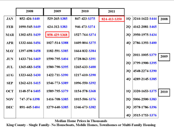
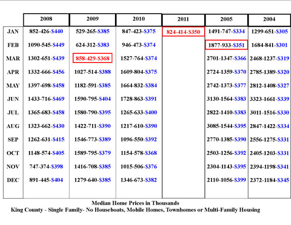
Before I post the data, I think we should strike the tiers of 2001 and 2011 based on all Single Family Home sales in King County only, since Case-Shiller tiers are based on a different set of criteria. For this purpose I remove single and double wides, houseboats and townhomes and deal only with detached single family homes. I am using the first 5,000- homes sold in each of those years to set the tier values, since my home calculator stops at 5,000 homes. For 2001 that is the 1st quarter sales. For 2011 that is through the end of April.

2001

Low Tier – < $216,000
Mid Tier – $217,000 – $310,000
High Tier – $311,000+

with median of high tier at $400,000

2011

Low Tier – < $274,000
Mid Tier – $274,000 – $447,000
High Tier – $447,000+

with median of high tier at $614,000

For those wondering why these Tier Pricings are so very different from Case-Shiller numbers, it’s because Case-Shiller combines King, Pierce and Snohomish Counties. These are for King County only. ALSO, I’m pretty sure Case-Shiller uses resale (matched pairs) and pretty much excludes New Construction entirely, and a lot of Redmond’s story and the high price tier story is in that New Construction.

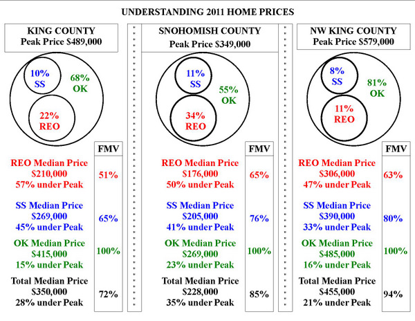
The dramatic change in the median price of the high tier tells us A LOT!

Obviously based on median prices, King County is no where near 2001 levels, BUT the following data is a bit startling.

graph (16)

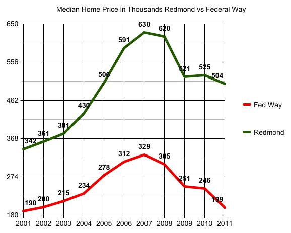
Redmond running a hair under 2005 median home price, but no where near 2004 median pricing. Federal Way on the other hand quickly degenerating toward 2001-2002 pricing.

Of course once you have some more information…you have to keep going to determine the why of it. “Why” never has ONE standout answer…but the mix of foreclosures is clearly a BIG part of the story.

2011 fwr

I remember reading a question on a general forum asking why a person can’t find a foreclosure home to buy in their area of preference, when all the news stories are pointing to the DELUGE of foreclosures? Well, ZOMG! that snapshot of the market above “tells a story…don’t it?” to quote Rod Stewart.

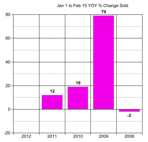
Now compare that to 2010 and you will quickly see why the Bottom Tier is pulling away…and getting HAMMERED!

2010fwr

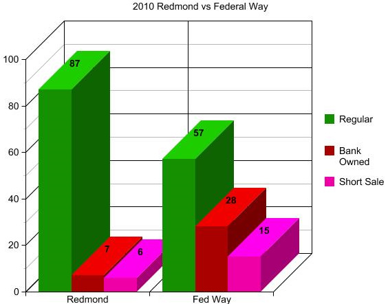
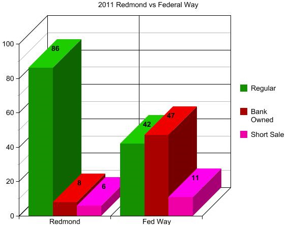
The % of Foreclosures and Pre-Foreclosures (short-sales) in Redmond has barely changed. Federal Way? Well…maybe they have no place to go but up? Certainly hope so.

Now let’s look at the HUGE decline in Price of Bank Owned Property 2010 to 2011. This is going to knock your socks off.

Sorry…have to throw this in as a link over. The chart won’t load.

The short of it for people who don’t like to click on links is that the Bank Owned Solds in Federal Way not only jumped UP from 28% of total sales to 47% of total sales, but the median price of those Bank Owned sales declined from $191,000 to $156,000. WAY below 2001 pricing, and with the volume of them, they dragged the median overall sold price down from $246,000 in 2010 to $199,000 YTD 2011. Maybe it will swing back a bit by year end. But Holy Caboley!

As you will also see in that link, Redmond Bank Owned solds did not change much at all as a % of total sales, BUT the median price of those dropped from $475,000 to $330,000. Still…not enough of them to impact the overall median sold price much in Redmond.

Redmond is easier for me to explain, since I don’t work in Federal Way. Let’s see if I can get another graph to load up. WordPress is liking graphs better than Raw Data Charts.

age

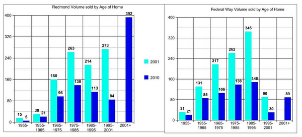
I combined these two so you can see the dramatic difference. Homes Sales in Redmond are being bolstered by the fact that a LOT of new and newer homes are being sold. You may see that change dramatically in 2012 as the builders seem to be shifting over to Sammamish due to the fact that they have used up a lot of the available land in Redmond.

To some extent the shift will move from 98052 to 98053, 98074 and 98075. But will the buyers shift with them? Probably yes, unless there are a lot more newer homes on resale in 98052 to compete with the travelling builders. You may say there are still plenty of newer resale homes in 98052, but track that against school rankings, and you will see what is happening there with regard to Elementary Schools.

So the drastic decline in Redmond Bank Owned Sold Price from 2010 to 2011 has a lot to do with the % of homes that are, or more aptly said WERE, newer homes. It looks like the glut of spec home leftovers here and there were pretty much sucked up in 2010 when 80% of the Bank Owned Sales were NEW…built since 2005…and most never lived in. Those empty new homes, some completely finished…some not so much especially as to landscaping, are pretty much gone.

Scanning at my notes here (my desk looks like the whacky professor after doing all of these stats on scribbles before processing them into charts and graphs) I’m seeing that the total # of foreclosed properties in Redmond 2011 that were built prior to 1980 are equal to the total # of foreclosures in 2010 of which 80% were built after 2005.

So the decline in price of foreclosed homes in Redmond (as noted in the link above) has more to do with the AGE of those homes, than a drop in prices.

Why the big drop in price in Federal Way? Age of homes does not seem to account for that. I don’t work in Federal Way…so it’s not as easy for me to read reality into the data there, as it is for me in Redmond. My best guess is that it is a degenerating market…like a cancer growing…each new set of foreclosures running off a discount of the current median price. Each new wave of foreclosures dragging that median price down due to sheer volume…and the downward spiral is feeding on itself.

Will be interesting to see if any of this swings back into place by year end. My gut tells me 2012 is going to be a wild ride. Looks like Federal Way has no place to go but up, let’s hope so.

Redmond on the other hand is likely going to lose a lot of that huge support from the new construction homes over to Sammamish, unless we start seeing a whole lot more newer home resales coming on market. That may also be good news for people in Redmond who have been trying to sell their built prior to 2000 homes. I have a feeling it will.

I just don’t see all of the Redmond buyers running over to 98074. Some, yes. Relocation Buyers, yes. But for the most part, either sales volume is going to plummet…or people are going to starting getting a whole lot more interested in some of those older homes that have been languishing on market during the new construction surge up on Education Hill. Probably a little of each.

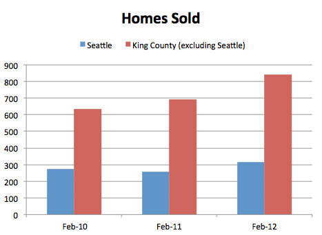
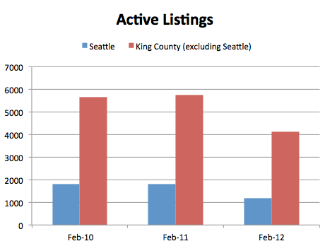
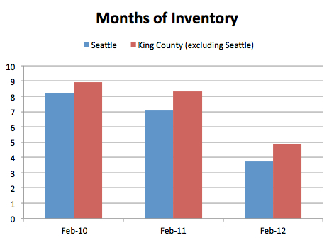
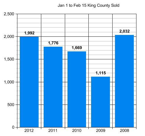
More graphs and data on the above HERE, HERE and HERE. The last one helps you track the median price for these two cities in each year since 2001, so you can see the rise and fall to and from peak.

(Required Disclosure – Stats in this post and it’s graphs and charts are not compiled, verified or published by The Northwest Multiple Listing Service.)

Should you buy a New home or an Old one?

Education Hill RedmondLots of people want a NEW Construction home, the same way they want a new car vs a used car. However starting the home buying process at “I want NEW” is just as wrong as starting the home buying process at “I want a foreclosure”.

As I have said many times, in my experience more people HATE their “home”, and want to move to a different one, because of WHERE it is vs WHAT it is.

“…and underneath all is the land…” and land is a limited commodity. So where is that NEW home going to be built? Maybe…just maybe…on the wrong piece of land. The lot no one built on prior to 2011…for good reason. Even NEW(er) home will raise this issue. So if you have your heart set on a NEW home…the number one question you need to ask is:

WHY DIDN’T ANYONE BUILD A HOUSE ON THIS PIECE OF LAND BEFORE TODAY?

So many people limit their looking to the obvious and the house itself. If you are looking at new or newer construction…begin your investigations at the land that home is sitting on. Looked at one yesterday…without going to it…via Google Maps and the Stormwater Management Comprehensive Plan for that area, and the house was built on a lot IN “The Wetlands”.

Think about that for a minute. What are the various reasons a lot might be available for someone to build homes on today…that is close in to work and good schools and shopping? It’s common sense really. Especially today…after a huge building surge from 2004 to 2008…was there really a piece of land the builders didn’t find and build on during that time? Yes…a few…but not many.

IF wanting a NEW house is your goalyou would be wise to first examine the land of it…and why no one built on it before (unless it is a tear-down lot). Oddly, the one I checked that was “in the wetlands”, well…really, you have to ask yourself. How DID it get built there? Basically one is not allowed to build a house in Wetlands. Why does it not require flood insurance with drainage basins to the north, east AND south of the house?

Think you can “see” all that? Well what about too close to underground gas pipelines? Can’t see that.

My point is you are better off listing all the things you want from a neighborhood, a location and a home, without regard to AGE of home. Then…if none that have the best location are new…well, maybe NEW Construction should not be the FIRST item on your “wish list”.

Prioritize that wish list by the where…before the what in that where. It’s common sense really, isn’t it?

If it has been a Best Place to Live for 10 to 100 years…it was likely built on before yesterday.

Have home prices “recovered” in Seattle?

The market “recovered” in early 2009, back when I called the “bottom”. Recovery means it returns to a predictable and normal cycle, and stays there for the forseeable future. We are now two and a half years from that “bottom call”, and if I had to describe the Single Family Home market as I did back in February of 2009…there would be little change from what I said at that time.

This is what I said, according to Aubrey Cohen, who is quoting me in the Seattle PI Front Page News Story “Agent Predicts Housing Slumps Demise“.

“…once a house is priced at least 20 percent below what it would have been expected to fetch at the market’s peak in the summer of 2007, it sells” (“bottom” of non-distressed property).

“She said distressed sales were going for about 37 percent below peak, and areas with a large share of distressed sales would see those dragging down prices across the board.” (bottom is 37% plus a continued drag down in areas where distressed sales are a high % of overall sales)

“In her call, DellaLoggia said she’s focusing on the North Seattle and East Side areas where she works.

Again, I’m quoting Aubrey Cohen…who is quoting me back in February of 2009.

If we are still running in those ranges…then the market actually “recovered” in February of 2009, which by and large it DID, depending on your definition of a market recovery.

Recovery does not mean it will never go higher or lower ever again. It means it has stopped the indiscriminate and unpredictable SLIDE, and returned to…a market that moves based on it’s normal basis up and down.

Let’s take a look at 2011 Home Sales Year to Date (Jan 1, 2011 to about a week ago when I ran these numbers and created the charts and graphs.)

2011 home prices

The last column, described as NW King County runs North of the I-90 Bridge to the end of King County going North and West of Lake Sammamish to the end of King County to the West. I would probably include Issaquah and Sammamish and Mercer Island in there as to markets performing similarly, but to define it in a solid block I drew the map search as defined above.

Are we still “at bottom” of if it is priced “20% below peak” for a non distressed, single family detached home? Yes…2011 prices are running at 16% under peak for NW King.

Are we still “at bottom” of 37% under peak for Distressed Property Sales, Short Sales (SS) and Bank Owned Sales (REO)? Yes…for Short Sales running at 33% under peak. NO for Bank Owned Property Sales running at 47% under Peak. Perhaps Bank Owned property has been damaged more so than homes people still live in. That could easily account for the difference.. As can the true “as is” nature of that particular beast. Those that must be sold ALL CASH as example…can’t be financed due to condition, will run under the price expected if the home could be financed without a “rehab loan”.

MOST IMPORTANTLY if you are a home buyer or seller…you have to note the % of distressed property that impacts YOU.

IF you live in a neighborhood that was built and sold out at PEAK…then your entire neighborhood will be dragged down by all of the short sales and foreclosures around you. IF you live in a neighborhood with 3 healthy sales and one short sale…the impact will be less…much less…perhaps none at all.

As with all of my posts, I try to give you a tool you can use. Take the “appraiser’s area” around your home. Usually that is in increments geographically based on data obtained. IF there are 5 sales within 6 months with 1/4 mile of your home (more true for newer homes built close together), then the appraiser may not leave your neighborhood to find more “comps”. As long is there is at least one within 60 days. Draw the circle and the small circles for SS and REO. Do one chart for 1/4 mile, one for 1/2 mile and one for one full mile. Even if they find 5 sold properties in 6 months within 1/4 more, the may reach out a full mile to drag in some short sales and REO sales for their own protection.

If ALL of the sales are in the SS box on your chart…and you think you are going to price at 20% under peak because YOU are not a Short Sale…no. Not gonna happen.

If MOST of the sales are Short Sale and REO in your chart…and you think you are going to price at 20% under peak…no…not gonna happen.

IF there are TEN sales and ONE is a short sale or REO…and IT sold for 30% to 40% under peak…no, you don’t have to price your home as low as that sale, as long as the other 9 homes sold without impact. You can discard the distressed property and use the other comps…but that doesn’t mean the buyer’s appraiser won’t drag that back in to his appraisal…because he is protecting the lender…not you or the buyer of your home.

********

(required disclosure: Statistics in this post and in the chart in this post are hand calculated by ARDELL and are not copied from data compiled, verified or published by The Northwest Multiple Listing Service.)


Seattle Area – How to Choose a “Best Place To Live”

Everyone wants to live in “the best place”, but how does one determine which is the best place for them…that also fits their budget? As with most of my posts I try to include a tutorial on how to utilize the internet to assist you in choosing wisely…or at least with informed consent.

I’ve talked before about how to use the internet to determine value and offer price. Let’s take that a step further. You don’t want a Great Deal…because you live in a block with drive by shootings and a sex offender in every other house. THAT is NOT a “Great Deal”!

The chart below is based on a one mile radius of a given address in each area mentioned. The sources of the data are at the bottom of the chart. To make your own chart, just put in the address of the homes on your “short list”.

What you personally value or can live with is different for each person.

Some may choose a home where the school is a 4 ranking and has 59 sex offenders within a one mile radius, because they like the house. Others may settle for a split entry or a townhome in an area where there is an 8-10 ranked school and only a few sex offenders and less violent crime. Everyone is different.

I don’t think I’ve ever assisted someone in buying a home that wasn’t in the best area their money can buy, but that’s a client to client process and client decision.

If you are choosing to not use an agent at all, or to use a discounted service that does not assist with home selection, you need to fend for yourself in that regard. Using these tools and making your own chart is not infallible, but it should help to insure that if you do buy in an area of high crime…you are at least doing so with informed consent. Double check the facts…don’t take these as “verbatim”. But they should help point you in the right direction as to getting the additional facts needed.

111aaa

WalkScore is often hailed as a great site, and some RE websites even show the WalkScore next to the property data. I’m NOT a big fan of WalkScore UNLESS you look at it along with a few other available sites. I AM a big fan of choosing the most highly ranked Elementary School you can afford.

Often…though not always, the best elementary school ranking is an indicator of fewer sex offenders and lower crime. That is why you may find that homes in the best Elementary School boundary lines are more expensive. Not because of the school per se, but because of all that goes with. The reverse, lower ranked school, does not always follow the same pattern. So do your due diligence and check all the details.

Take a look at the chart above. Notice that two of the highest WalkScores also have the most sex offenders and highest Violent Crime score. (V = violent Crime / P = Property Crime) as shown on HomeFacts.com You will also see the reverse. Point being that “WalkScore” does not overlay crime statistics, as some think it does. You need to use a variety of sites and sources to get all of the information available, and not just one site.

HomeFacts will also show you the pictures and addresses of the “offenders” if you open the drop down menu. A handy site.

My “theory” has always been that the highest ranked elementary schools (that have a geographic admission boundary vs “choice” schools) will also have the lowest crime and sex offender stats. That does not mean the reverse is true. You need to pull the data as it applies to your area of interest.

The reason I use Elementary School, vs middle or high school, is it helps you grade the neighborhood on a smaller geographic base than middle or high schools that draw from a larger geographic area.

Another nifty site that I just found is NabeWise and it is no surprise to me that if I put in Seattle Metro and Safety, the two neighborhoods I choose to live in BOTH come up in the TOP EIGHT!

Using the Internet to Find a Home is not ONLY about looking at PRETTY PICTURES and then hiring a Discount Commission service to buy it. The most deeply discounted “Agent” services clearly indicated that HOME SELECTION is YOUR JOB and why you are paying a lower commission. That is not merely about “the house”.

If you are going to use the internet to save on real estate commissions…and I am all FOR that…please…use as many sites as possible to find as much information as you can, before “doing it yourself” to save on commission.

Seattle Area Home Prices Hit New Low

King County Home Prices hit a new low in January of 2011. There’s definitely something a little odd going on, as median home prices do not usually fall by $32,000 in one month. But then November and December of 2010 should not likely have gone up as much as they did, unless the market is positioned to start ramping upward, which no one really expects to happen.

The only conclusion is the market is teetering on WTH to we do NOW! …or lot’s of people read my Oh NO! People are starting to overpay for houses again post.

No more tax credits, market should have gone down. But 2010 ended higher than it began. Totally unexpected and irrational.

Take a look for yourself. The blue $ is the King County Median Home Price in Thousands. The red blocks mark the bottom of the decline from PEAK Pricing in July of 2007 to March of 2009 and the second red block is where we are now at the end of January 2011. The first number in each 3 number sequence is number of homes closed. The middle number is the halfway point (median) as to units sold. Some are not exactly half as more than the perfect number sold at the same price to stop at exactly half sold for more and half sold for less.

Example: Jan 2011 824-413-$350 means 824 homes sold and 413 of them sold for $350,000+.

A NEW low!

bottom chart

The quarterly median graphs on the right above show you that in a flat market a year ends about where it started as to 1st and 4th quarter and the 2nd and 3rd quarters are usually higher. That is what they call “Spring Bump” and what a “normal” relatively flat year looks like.

Now let’s look at where King County Home Prices are BACK TO with this NEW LOW.

2004-2005 prices

NOT at 2004 pricing YET…but very close. A small $5,000 drop from here will put us at December 2004 level.

At the moment, as you can see in the above graph, we are at February 2005 pricing.

We had been running at or above April 2005 pricing for quite some time. For years…many years,and consistently for the last two years. So this new low is quite a “newsworthy” event.

I think we will “Spring” back up to $375,000ish pretty quickly…but for now, we have a new low. What will cause the rise up? Some people with really nice houses who are not upside down getting on market and listing their homes. There are more buyers today than there are nice homes, priced well, to buy. But I expect that to change, and for prices to get back up to the $375,000 level fairly quickly. If not in February, than by April at the latest.

********

(Required Disclosure: Stats in this post and in the charts in this post are not compiled or published by The Northwest Multiple Listing Service.)