Real Estate, cost of doing business, is often blamed for why “we” need higher and highest Real Estate Commission levels. As a follow up to my previous post I will tell you what I am NOT “good at”. That should make Craig happy. 🙂
I am not good at Bullshit! I seriously am just not good at “flowery language” to describe homes I list for sale. Never was, and will never be, my forte. If you have ever seen over the top flowery language on one of my listings in 21 years…the seller of the house must have written it, because I am sorely lacking in that “talent”.
I am very good at making “the product” the best it can be before it hits the market. I am better at “staging it to sell” than a stager, because I use staging to highlight the home’s best features. I am not “decorating” the home. I am putting up signals to the home’s features. BIG DIFFERENCE that I can’t seem to explain to “home stagers”.
The staging follows the Home Flyer pattern as to Best Features of the home.
When Making a Flyer I start with a list of why someone would or should buy THIS house vs the others that are for sale of like-kind home style. This home happens to be a “split entry”. So I look at it in relation to other Split Entry homes for sale within a half mile or so. Distance is not the key as much as having enough comparison product. If I can get that within .25 miles…that may be all I need. If I have to go out a full mile, then that is what I need. I want at least 3 to 5 On Market similar homes to use as a benchmark.
Here is the list of my “competition” for this particular home and product. Since it is now listed, the 2nd one on the list is actually this property. There were two others on market when I was preparing the listing and working through this process that are now pending. One was listed at $254,000 and the other for $267,000, leaving mine positioned as 2nd in “the pack” with the bank-owned as 1st, as it should be. We are “ahead of the pack” but not as low as the bank-owned home. That is “correct placement”.
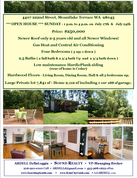
Here is The Home Flyer:

As you can see from the flyer, I totally suck at “flowery language”. No words like “oasis” or “vista” or “exceptional” or “stellar”…just the facts. I’m very Jack “just the Facts M’am” Webb in that regard. A shortcoming, yes…but just how it is.
I had to re-design as in “downgrade” this flyer template to a one page, one sided, Flyer. I was using that fancy 11 X 17 folder over 4 page $3.00 apiece style flyer for awhile…and reverted back to this simple flyer as has been my long time custom. They cost $.39 apiece to print over at MinuteMan Press. They don’t bleed and sweat and run as to the ink like the ones I might print myself on an inkjet printer.
I pay for the “upgraded never ending flyer box” so one can be in the box at all times, even if people take them all, as one sits in the plastic cover in the front so people can see it even if the flyers are “out”. I think that costs an extra $2.00 for the life of the listing. 🙂 The sign up and down costs about $60 or so. One fee up front for both sign up and sign down. I paid a little extra for the Open Sunday 1-4 Rider to go up with the sign, vs my placing it there myself, so that it was an immediate announcement.
I do two Open Houses two Sundays in a row, back to back, and put it on the flyer.
Often the picture of the front of the house is NOT on the flyer, as noted above, as the person holding the flyer from the flyer box is usually standing IN FRONT of the house. He can SEE the front of the house and nothing else. So if I have room for 6 pictures, I want him to see the key selling points that he can not see from where he is standing.
The #1 feature of this house vs the newer homes in the area is the lot size, the big yard, the privacy trees, and the outdoor deck. These are the things WE have that the new, slightly pricier, zero lot line houses do not have. So I have devoted HALF of the photos to that aspect of the home that they cannot see when standing out front.
Back to staging for a second.
That is also why I removed some of the curtains, most all on the back of the house, and decorated “sparingly” so the eye would be drawn OUT to our best feature
vs IN to some overly nice furniture.
I am drawing the eye to the best feature when staging…NOT “decorating” a house.
Next of note as to FEATURES we have that the others in the lower price range and some in the higher price range in the list in the link above do not have is a NEWER ROOF and all NEWER WINDOWS. Pricey improvements for a buyer to make after purchase if they buy the other house that needs all new windows and a new roof.
So THAT is the number one item (both included) on the flyer below the price.
Back to Staging. I have NO curtains so you can see the full framing of the newer windows and sliding glass door as curtains are “prettier” but curtains cost ten bucks and new windows and sliding doors cost $4,000 bucks or so. So I want you to see the windows…NOT the “pretty curtains”.
You see how “staging” follows the Flyer as to Key Selling Points of the home. The staging highlights those features…it does not “decorate” the home. It UNVEILS the best Real Estate FEATURES of that home. You are not buying “the pretty furniture”.
Yes a cute rug would be pretty in the living room, but I am selling the hardwood floor, not a pretty area rug.
So there’s my weakness…I can’t talk about “Welcome home to your OASIS close to Freeway Access”. I don’t know if this should be YOUR home or not and I don’t know if you need an “OASIS” to run off to after work. I don’t know you at all. You are someone holding a flyer whom I will likely never meet.
I don’t want to tell you WHY YOU should or should not buy this house. I just want to talk about the house and it’s features, and make it easy to SEE those features if you come inside the home.
It’s my shortcoming…and I really don’t know what to do about it. But most of my listings sell in less than 90 days when I do this well, so I’m going back to doing THIS as I do it best. Blunt…straightforward, no flowery language.
Do Fancy Flyers with Flowery Language sell homes? I don’t know. You tell me.


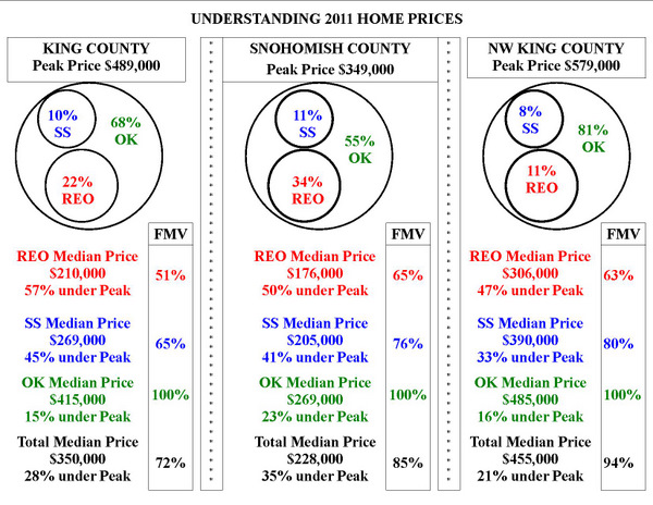
 Seems to me that any thoughtful analysis would say, “No.” Really, in some ways this might be one of the worst times to buy, second only to buying into an existing and already overinflated bubble (say, 2005-08). [Editor’s Note: probably inappropriate hyperbole.] Why? Two factors:
 We all remember Tom Hanks in “A League of Their Own” and that great line “There’s no CRYING in Baseball!” That doesn’t mean it NEVER happens, that means it is not SUPPOSED to happen.